


One page, built to convert
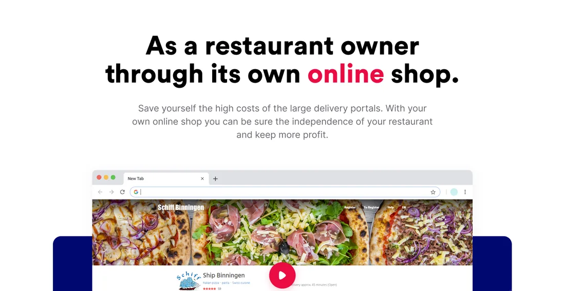
A long-form marketing landing that sells restaurant owners on running their own online shop, paired with the design system it is built from: the Satoshi type family, a documented colour system, and a component library the whole page is assembled from.
Category
- Marketing landing
- Product website
Deliverable
- Long-form landing
- Design system
What we did
- UX & UI design
- Web design
Foundations
- Satoshi type system
- Component library
A landing page is a sales argument, laid out
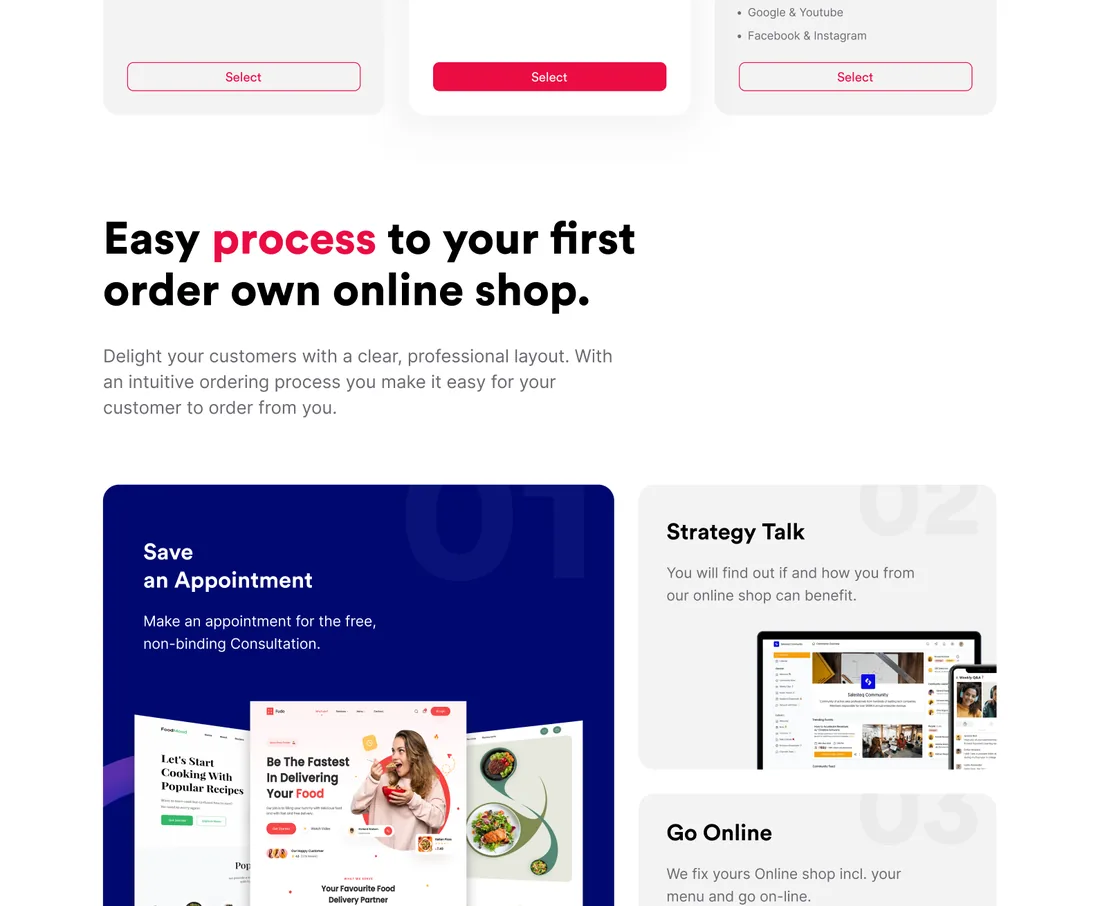
This page has one job: turn a restaurant owner who is tired of paying delivery-portal commission into someone who books a call. Every section is a step in that argument, and every section is built from the same underlying design system.
The page and the system it is made of
The visible deliverable is a single, long marketing page. The invisible one is the design system beneath it: a typeface, a colour language and a set of components, documented so the page stays consistent and the next page inherits the same rules.
How does the page make its case?
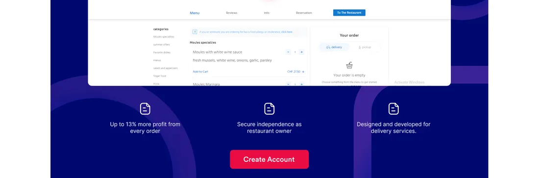
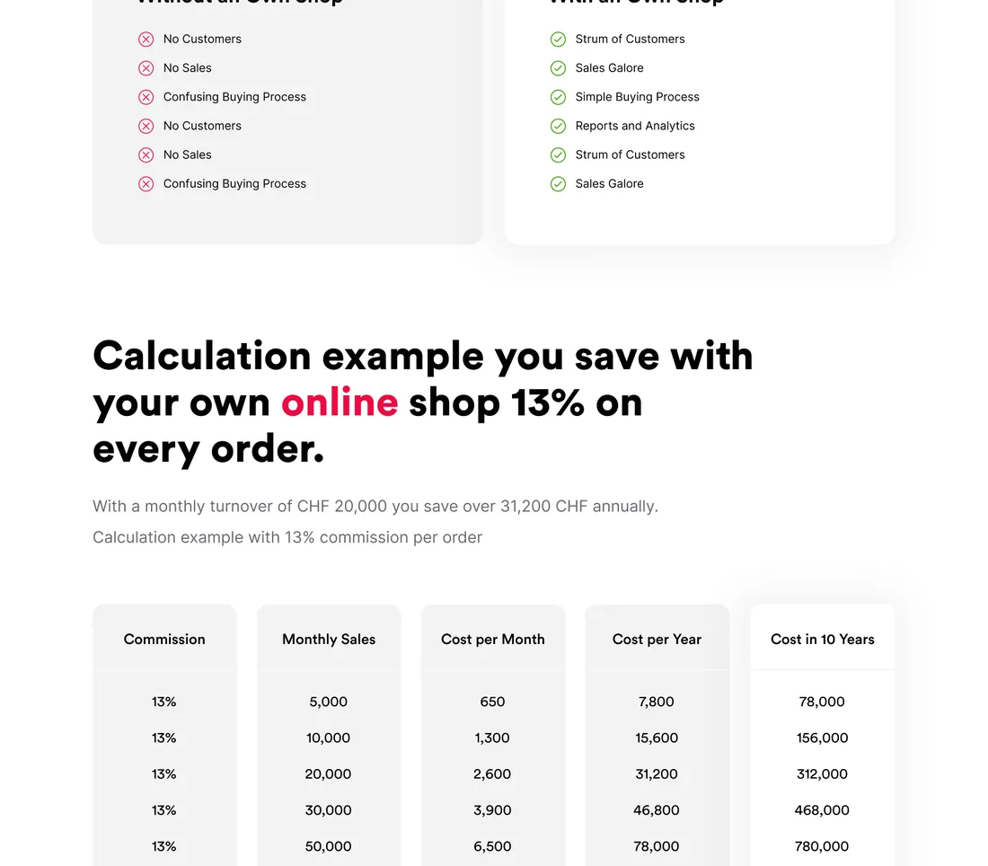
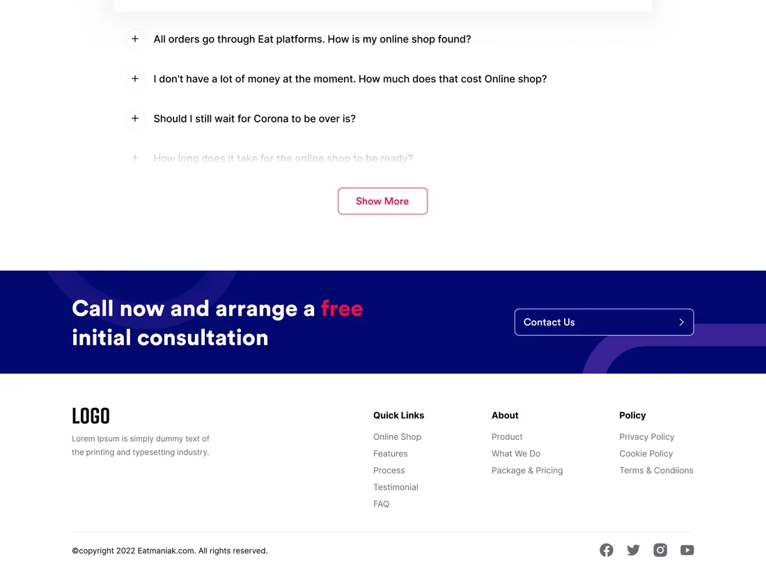
Read top to bottom, the landing walks a restaurant owner from the pitch to the point of booking a call. Each section below is a real part of the delivered page.
What does a landing page that actually converts need?
These held true here and hold for any product landing whose job is a booked call, not just a nice scroll.
- One argument, in order. A landing is not a brochure; every section is the next line of a single case, and anything that does not move the reader is cut.
- Feeling, then figures. An emotional comparison earns attention; a concrete breakdown earns belief. A good page does both, in that order.
- A small next step. Nobody buys a platform from a page. The call-to-action asks for a free call, not a commitment, so the yes is easy.
- Objections answered before they are voiced. The FAQ exists to clear the doubts that would otherwise stall the decision.
- A system underneath. A documented type scale, colour language and component set are what keep a long page consistent and the next one fast to build.
What is the page built from?
These values are read from the project's own design system, not sampled off a screenshot. The delivered landing wears one action colour, a crimson pink, over deep navy and a neutral scale, and sets everything in the Satoshi family.
Aa
Primary typeface
Satoshi
A B C D E F G H I J K L M N O P Q R S T U V W X Y Z
a b c d e f g h i j k l m n o p q r s t u v w x y z
0 1 2 3 4 5 6 7 8 9 & ? ! £ $ €
48pxRestaurant online shopH136pxSection headingH224pxSub-headingH320pxCard headingH416pxLead copy and buttonsH514pxBody textBodyRead from the project's documented design system: the Satoshi family in four weights across an eight-step scale, alongside a colour system with brand, semantic and neutral roles and a component library of buttons, chips and toasts. Satoshi is an open-licence typeface; the specimen above falls back to the nearest available face if it is not installed on your device.
Building a marketing landing and a design system
The questions we hear first about landing pages and design systems.
Ask us yoursWhat makes a landing page convert?
Structure more than decoration. A page that converts is a single argument laid out in order: a clear promise, proof, a concrete comparison, a small next step and answers to the obvious objections. Eatmaniak follows exactly that sequence, which is why the design work is as much about what each section has to achieve as about how it looks.
Why build a design system for a single page?
Because a system is what keeps a long page consistent and makes the next page cheap. Defining the Satoshi type scale, the colour roles and the components once means every section is assembled from the same parts rather than redrawn, and a second or third page inherits the rules instead of reinventing them.
What typeface and colours does it use?
The type is the Satoshi family in four weights, Black, Bold, Medium and Regular, across an eight-step scale. The colour system pairs one crimson-pink action colour with a deep navy for dark sections, a neutral grey scale, and documented semantic colours for success, warning and error states.
How long does a landing page like this take?
A single long-form landing with a supporting design system is a matter of weeks rather than months, and most of the effort is upfront: agreeing the argument the page has to make and defining the system it is built from. Once those exist, the page itself comes together quickly and the next one faster.
How much does a marketing landing page cost?
It depends on scope, and no honest figure comes from a screenshot. The biggest drivers are whether a reusable design system is in scope, how many sections the page carries, and how much custom illustration or motion is involved. Shanti Infosoft scopes it on a short call and returns a fixed quote.
Related work
Need a page that turns visitors into calls?
Tell us how your business actually works and we will tell you honestly what it takes to build. See more of our work or what we do.
Book a 15-minute call