Case study · Zircon Medical

Science,made shoppable

A bilingual product and e-commerce website for a Swiss ceramic dental-implant maker: a clear product story, a science and clinical-case library, a partner-certification funnel and an online shop, for dental professionals and patients alike.

Product websiteE-commerceMedical device
Zircon Medical product screen
What we shipped
Product & science siteOnline shopPartner funnelEnglish & GermanUI/UX designE-commerce
01 — The product

One site, two audiences, a lot of evidence

Dental professionals come for the science, the clinical cases and a route into a certified-partner programme. Patients come to understand a product and find a provider. The site is structured so each audience finds its own path quickly, while a science and clinical-case library carries the depth that a claim in a medical field demands.

Product overview

A clear, structured presentation of the ceramic implant system, pitched so both clinicians and patients can follow it.

Science & clinical libraries

An organised home for the peer-reviewed studies behind the product, plus a catalogued library of clinical cases that shows it used in practice.

Partner programme

A structured route for clinicians to apply and train as certified partners, turning professional interest into a pipeline.

02 — The problem

Why is a medical-device website hard to get right?

Selling a clinical product online means holding three things in tension at once: rigorous evidence and a premium, reassuring feel; two audiences with opposite needs; and commerce sitting alongside science without cheapening it.

A generic template would answer evidence with a downloads page nobody opens, one message for everyone regardless of who is reading, and a contact form standing in for a partner programme. None of that holds up for a clinical claim.

2

languages carried as equals throughout the site — English and German, not a bolted-on translation

03 — Goals & challenges

What the site had to achieve

Dental professionals come for the science and a certification route; patients come to understand a product and find a provider. Both had to be served without confusing either.

Goals

What the site achieves

  • Evidence, organised. A science section and a clinical-case library gather the studies and cases so the product's story is backed by material, not adjectives.
  • A path for professionals. A partner programme invites clinicians to apply for certification, turning interest from the profession into a structured funnel.
  • Bilingual by design. English and German are first-class throughout, matching a European medical audience rather than bolting on a translation.
Challenges

Why it was hard

  • Evidence has to be reachable. A science-led product lives or dies on its studies and cases, but a wall of PDFs helps no one.
  • Professionals and patients differ. A clinician wants data and a certification route; a patient wants reassurance and a provider.
  • Commerce sits next to credibility. An online shop has to sit beside peer-reviewed science without making the whole thing feel like a storefront.
04 — Built for

Who is the website for?

The site is built around 2 audiences — dental professionals who come for the evidence, and patients who come to understand a decision about their own body.
Dental professionals view
Professionals

Dental professionals

Come for the science, the clinical cases and a route into a certified-partner programme.
Patients view
Patients

Patients

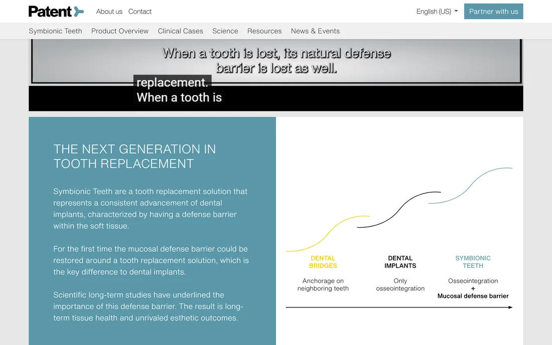
Come to understand the product and find a provider — the home page breaks down the core difference, a mucosal defense barrier, in plain, visual terms before anyone digs into the clinical science.

05 — How we built it

How did we build a site that sells science?

Evidence
01

Organise the evidence

The science and clinical cases were structured into libraries a reader can actually navigate, so depth becomes an asset rather than a wall.

Science library
Audience
02

Split the two paths

Professional and patient journeys were mapped so each audience reaches its own content and next step quickly.

Two paths
Partners
03

Build the partner funnel

The certified-partner programme was designed as a structured application and training route, not a lone contact form.

Certification
Commerce
04

Weave in commerce, bilingually

The shop and full English/German support were built in so the site can sell across Europe without diluting its credibility.

EN / DE

keep scrolling — the deal glides left →

06 — Across the site

What does the website actually hold?

Every surface below is part of one premium, bilingual home for a clinical product, from the first impression to a checkout.
A premium, confident openingThe product story, told clearlyA science library, not a downloads dumpReal clinical cases, cataloguedA route into the partner programmeManufactured in-house, since day one

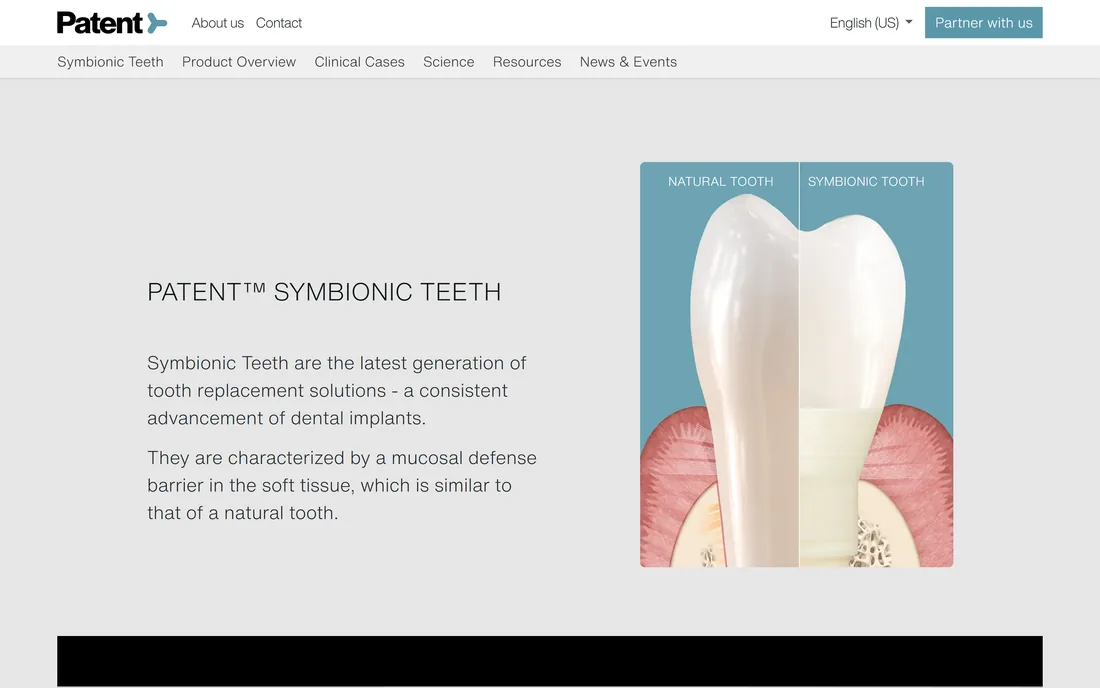
A premium, confident opening

Home · First impression

The site opens on the product with the calm, exacting tone a clinical audience expects, and a clear route deeper for either audience.

Home

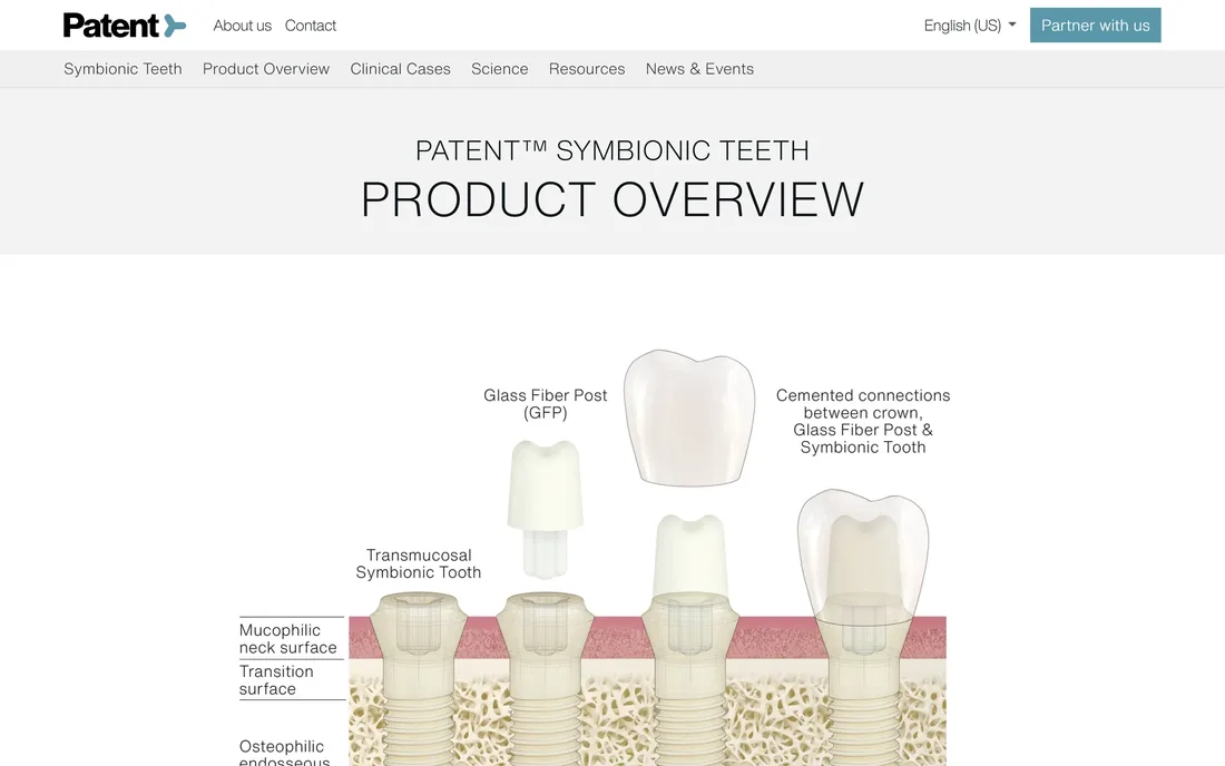
The product story, told clearly

Product · The overview

The product overview lays out the system in plain, structured terms so both a clinician and a patient can follow it.

Product overview

A science library, not a downloads dump

Science · The evidence

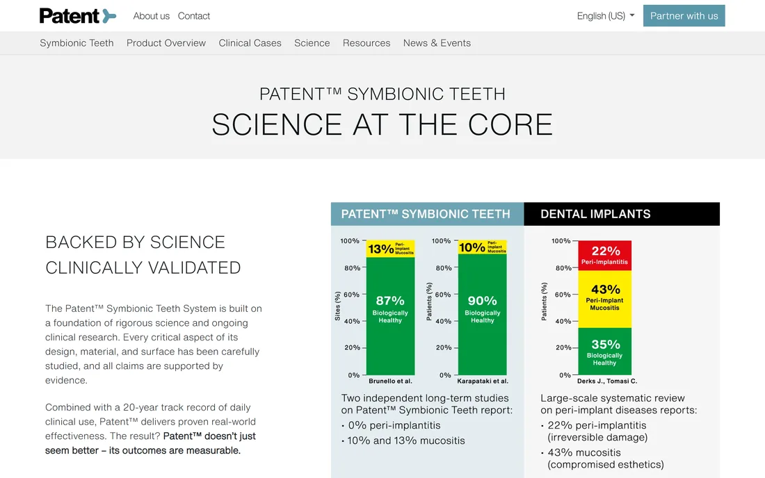
Studies are organised and presented so the evidence behind the product is genuinely reachable.

Science

Real clinical cases, catalogued

Clinical cases · In practice

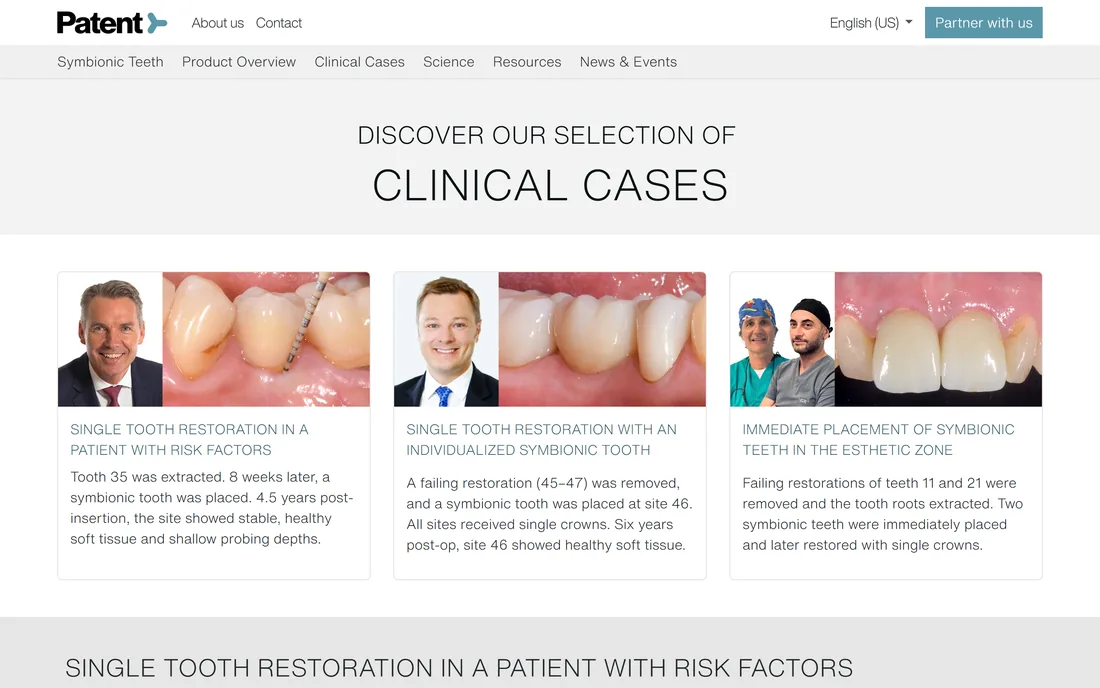
A library of clinical cases shows the product in practice, giving professionals the specifics they look for.

Clinical cases

A route into the partner programme

Partners · The funnel

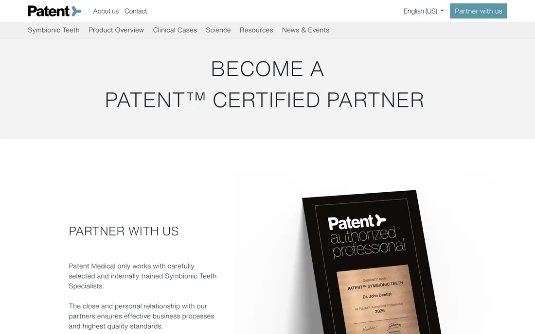
The partner programme invites clinicians to apply for certification, turning professional interest into a structured next step.

Partner programme

Manufactured in-house, since day one

About · Facilities

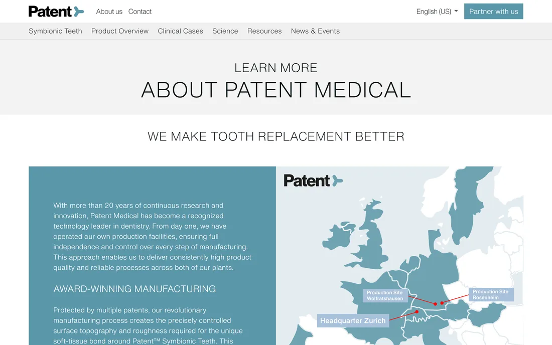
More than 20 years of research sits behind the product, made in the company's own production facilities under multiple patents — the kind of manufacturing credibility a clinical claim needs.

Zurich HQOwn production
07 — Visual design

What does the interface look like, and why?

A calm steel teal carries the brand against near-white and a deep charcoal, so the site reads as clinical and premium rather than loud. Helvetica Now keeps every page quiet and exact, the kind of restraint a medical audience reads as competence.

Colour
Steel teal
#5A97A9
Deep teal
#385F6B
Pale steel
#9DC1CC
Charcoal
#212529
Near-black
#0B1315
Mist
#E6E6E6
White
#FFFFFF
Typography
H1 · 300The next generation in tooth replacement
H2 · 300Section heading
H3 · 500Card heading
Body · 300Lead and body copy
Eyebrow · 500PRODUCT OVERVIEW
FAQ

Building a medical-device product website

How long does it take to build a medical-device website?
A bilingual product site with a science library, a clinical-case library, a partner funnel and an online shop is a multi-week to few-month build. The driver is rarely page count - it is how much evidence has to be organised, how many audiences and languages the content serves, and how commerce and credibility are made to coexist. We phase it so the product story and evidence stand up before the shop and secondary sections.
How do you present scientific evidence without burying visitors?
By treating evidence as content to be designed, not files to be dumped. Studies and clinical cases are organised into browsable libraries with clear structure, so a professional can reach the specifics quickly while a patient still gets a readable overview. The depth becomes a reason to trust the brand rather than a wall to bounce off.
Can one site serve both clinicians and patients?
Yes, and for a medical brand it usually must. The two audiences want opposite things - data and certification versus reassurance and a provider - so we shape navigation and content into clear paths that let each reach its own material without confusing the other.
Can it sell online and stay credible?
It can, if commerce is woven in rather than bolted on. A cart, wishlist and checkout can sit beside peer-reviewed science as long as the design keeps the premium, clinical tone throughout. The shop should feel like part of a trusted brand, not a storefront wearing a lab coat.
Let's build

Bringing a clinical product online?

Tell us how your business actually works and we'll tell you honestly what it takes to build - the evidence, the audiences, the commerce. No deck, no pitch.