


Insurance, made clear
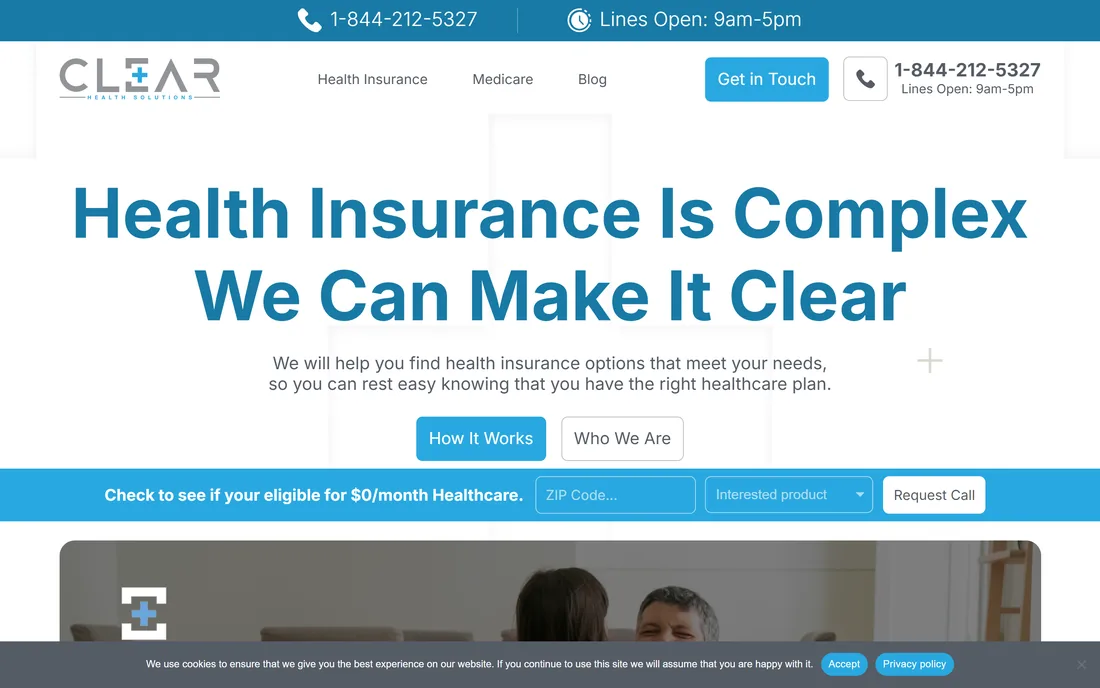
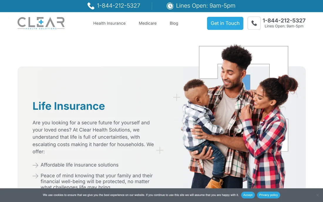
A guidance website for a US health-insurance brokerage: individual and family ACA plans, Medicare Advantage and life cover, each explained in plain language with a clear route to a call.
Sector
- US health insurance
- Brokerage & guidance
Coverage lines
- Individual / ACA
- Family
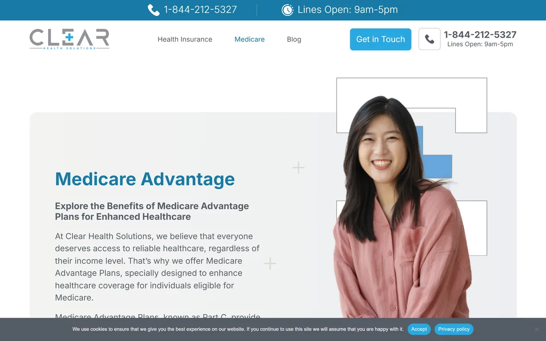
- Medicare Advantage
- Life
What we built
- UI/UX design
- Marketing website
- Blog & SEO content
Surfaces
- Home & service pages
- Enrolment enquiry
- Blog
What is the website for?
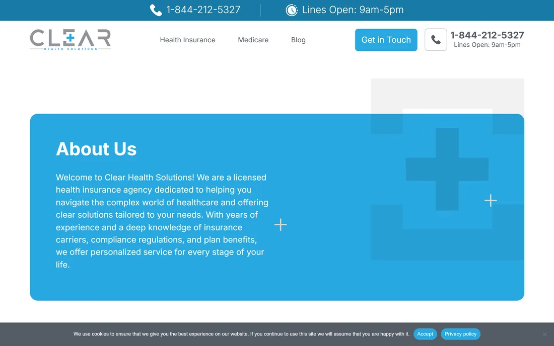
Choosing a health plan is where most people freeze: too many acronyms, too much fine print, no plain answer. Clear Health Solutions is a brokerage that guides people to affordable cover, and the website is built to make that first step feel simple rather than daunting.
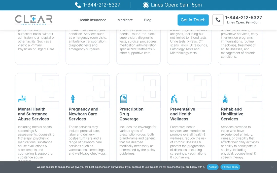
One clear path from confusion to a conversation
Every page carries the same promise: read what a plan actually covers in plain language, then talk to a real person. Coverage lines each get their own page, and a single phone number and enquiry route run through the whole site so a ready visitor never has to hunt for the next step.
Why does buying health insurance feel so hard?
Three things make coverage intimidating, and a guidance website has to answer all three before a visitor will pick up the phone: jargon nobody explains, choices that all look alike, and no sense of who is actually on your side.
| Choosing cover | On your own | With the guidance site |
|---|---|---|
| Understanding benefits | Decode the policy PDF yourself | Ten essential benefits in plain English |
| Picking a coverage line | Guess which plan type fits | A page each for individual, family, Medicare and life |
| Comparing options | Open ten tabs and lose track | One brokerage that narrows it for you |
| Getting help | Wait on a call-centre queue | A direct number with opening hours on every page |
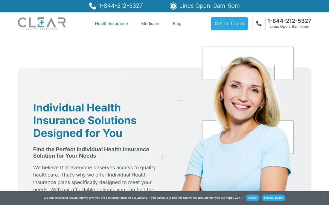
Preventive & wellness
Stay aheadScreenings, vaccinations and counselling that promote overall health, lower the risk of chronic illness and catch problems early.
- Screenings
- Vaccinations
Ambulatory services
OutpatientCare delivered without a hospital admission, from a primary-physician visit to urgent care.
- Primary care
- Urgent care
Emergency services
When it countsRapid treatment to stabilise a condition, including ER visits, ambulance transport and emergency surgery.
- ER & ambulance
Hospitalisation
InpatientRound-the-clock supervision, diagnostics, surgical procedures, medication and specialised inpatient treatment.
- Surgery
- Diagnostics
- Recovery care
Lab work
DiagnosticsBlood and urine tests, X-rays, CT, MRI, ultrasound, pathology and microbiology.
- Imaging & tests
Pediatric care
For childrenPreventive services, immunisations, routine check-ups and management of both acute and chronic conditions.
- Immunisations
Mental health & substance care
Whole-personScreenings and assessments, counselling and therapy, psychiatric medication and substance-use support.
- Therapy
- Substance support
Pregnancy & newborn
MaternityPrenatal care, labour and delivery, postpartum care and newborn screenings and check-ups.
- Prenatal & delivery
Prescription drugs
PharmacyCoverage for medically necessary brand-name and generic prescriptions under the plan's guidelines.
- Brand & generic
Rehab & habilitative
RecoveryPhysical, occupational and speech therapy for people recovering from injury, illness or disability.
- PT / OT / speech
How does the site move someone from lost to covered?
The whole experience is designed as three unhurried steps, so a visitor always knows where they are and what happens next.
What makes an insurance website people actually trust?
These principles came out of building a guidance site for a brokerage, and they hold for any regulated, high-stakes service that has to earn confidence before it earns a call.
- Explain before you sell. Define the jargon on the page; a visitor who understands the cover is a visitor who will call.
- One page per decision. Give each coverage line its own focused page so nobody has to hold four products in their head at once.
- Keep the human in reach. A persistent number and hours signal a real team, not a lead-capture form pretending to be one.
- Lead with guidance, not a quote wall. Trust in a brokerage is built by helping first and asking second.
- Write the way people ask. Match the words a worried buyer would actually use, not the language of the policy document.
- Let the blog do the reassuring. Plain-English articles answer the questions people are too unsure to ask out loud.
What does the interface look like, and why?
A clear sky blue carries every action and link, set against clean white and a soft blue tint, so the site feels calm and open rather than clinical. Inter keeps the plain-language copy easy to read at every size, which matters when the whole point is to make dense subject matter feel approachable.
Aa
Primary typeface
Inter
A B C D E F G H I J K L M N O P Q R S T U V W X Y Z
a b c d e f g h i j k l m n o p q r s t u v w x y z
0 1 2 3 4 5 6 7 8 9 & ? ! £ $ €
40pxWe can make it clearH126pxSection headingH220pxBenefit card titleH316pxLead and body copyBody12pxESSENTIAL HEALTH BENEFITSEyebrowColours and the Inter type stack are read from the live site's own computed styles. Inter is an open-licence typeface; the specimen falls back to the nearest available face if it is not installed on your device.
Building a health-insurance guidance website
The questions brokerages and agencies ask us first, answered plainly.
Ask us yoursHow long does it take to build a health-insurance website?
A guidance site of this shape - a home page, a page per coverage line, an enquiry route and a blog - is typically a few weeks of design and build rather than a multi-month programme. What moves the date is how many coverage lines need their own page and how much plain-language content has to be written and reviewed for accuracy.
How do you make insurance content easy to understand?
By writing to the question, not the policy. The essential benefits and each coverage line are explained in the words a worried buyer would actually use, with the jargon defined on the page. The layout keeps one idea per card so nothing has to be held in the reader's head, and a call is always one tap away for anything the page cannot answer.
Can the site generate leads without feeling pushy?
Yes, and that is the whole design intent. Rather than an instant-quote wall, the site leads with guidance and keeps a direct number and opening hours in reach on every page. Interest converts into a real conversation with a broker, which is how a brokerage actually earns a client.
Do you build the blog and SEO content too?
We can. The blog answers the questions people are unsure enough about that they would rather read than ask, which is exactly the content search engines reward for this subject. We structure articles around real questions so the site keeps drawing in visitors who are early in deciding on cover.
Related work
Want a website that turns a complex service into a clear next step?
Tell us how your business actually works and we will tell you honestly what it takes to build. See more of our work or what we do.
Book a 15-minute call