


Wellbeing in the hand
A two-sided mobile app that pairs people with wellness experts: browse and book coaches, join live events, track mood, read and watch, and subscribe - with a full expert side for the coaches who deliver it.
Sector
- Health & wellbeing
- Coaching marketplace
Product
- Mobile app
- iOS & Android
What we did
- Product design
- UI/UX
- 110 screens
Audiences
- Members
- Experts & coaches
What is My Flourishing?
Looking after your wellbeing usually means juggling a meditation app, a journal, a booking tool and a search for someone qualified to talk to. My Flourishing folds all of that into one app: a place to feel your mood, find an expert, join a live session and keep a daily habit - with the coaches who deliver the care on the other side of the same product.
Two apps in one product, sharing one moment of care
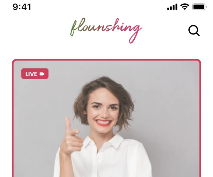
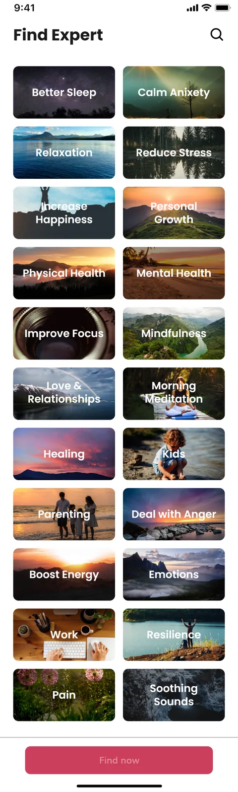
Members open the app to a home built around how they feel today - a mood tracker, live events, experts to browse by topic, and things to read and watch. Experts and coaches get their own side: bookings, availability, video sessions, ratings and earnings. Both live in one design system, because the session they share is the whole point.
Why is a wellbeing marketplace hard to design?
Pairing vulnerable moments with paid experts raises problems a simple directory never has to solve: two audiences who need opposite things, a daily habit that has to survive the gaps between sessions, and money and trust in the same flow.
| Looking after wellbeing | The usual way | In My Flourishing |
|---|---|---|
| Tracking how you feel | A separate journal app | A mood tracker on the home screen |
| Finding an expert | Search and hope | Browse by topic, name, reviews and rating |
| Meeting them | Book elsewhere, meet elsewhere | Live events and video sessions in-app |
| Keeping the habit | Willpower alone | Tips, blog and daily check-ins |
| Paying | Invoices and transfers | Subscription for members, payouts for experts |
How did we design a product for two audiences at once?
The design started from the shared moment - a session between a person and an expert - and worked outwards into two sides that meet cleanly in the middle.
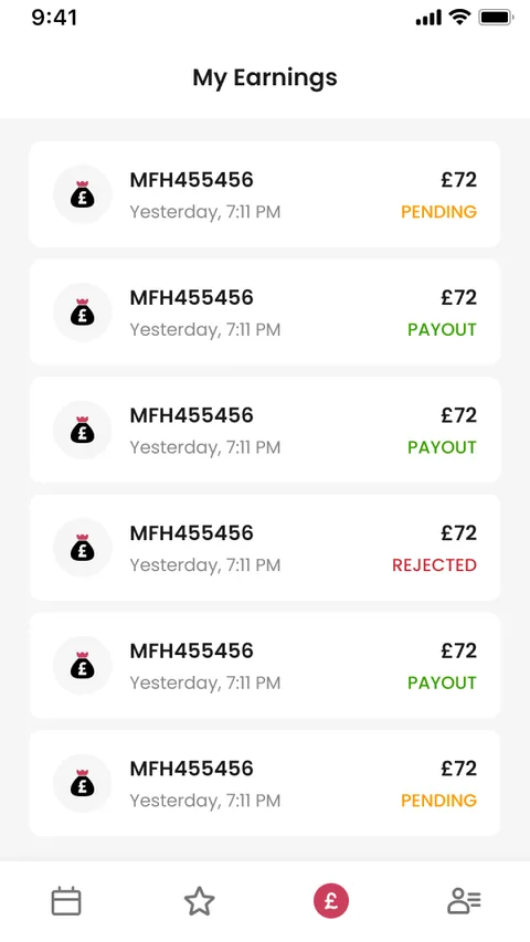
What does a member actually do in the app?
Every screen below is a real designed screen from the member side, drawn to make a moment of wellbeing feel light rather than like another task on the list.
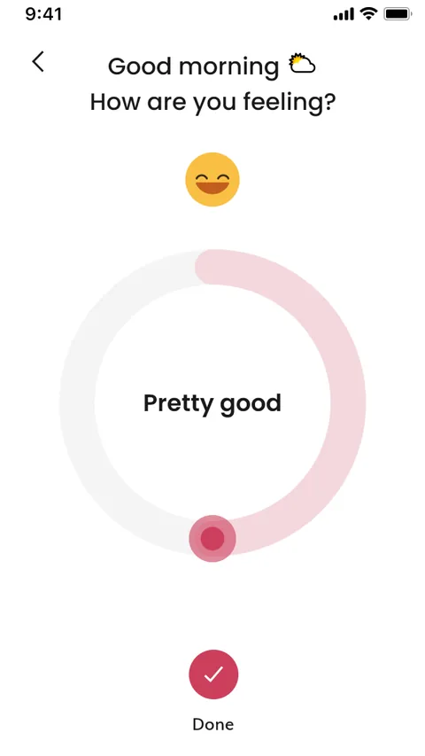
Log a mood
A quick, warm check-in that turns 'how am I today?' into a single tap and a running picture over time.
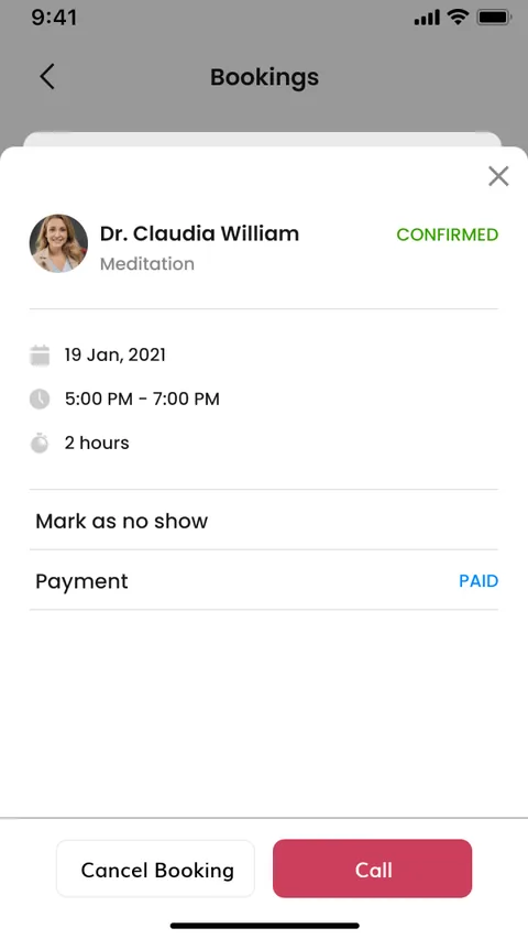
Book a session
Choosing an expert and a time is stripped to the fewest decisions, so booking care never feels like hard work.
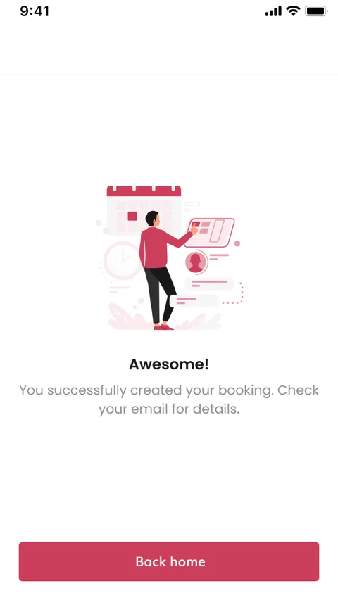
Confirmed
A calm confirmation closes the loop, so a member always knows the session is set.

Meet live
The session itself happens in-app over video, keeping the whole relationship inside one place.
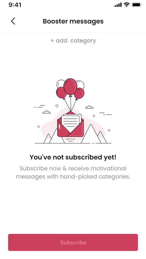
Booster messages
Short, encouraging nudges keep the habit alive between sessions, on the days nothing is booked.
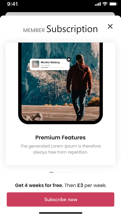
Membership
A clear subscription unlocks premium features, priced and presented so the value is obvious before the commitment.
One product, two very different jobs
Members and experts share the same design language but land in different worlds - one built for calm, one built for control. Tap between them to see how the same product serves each.
- Log mood & check in daily
- Browse experts by topic & name
- Join live events & video sessions
- Read tips & blog
- Manage subscription
What does a two-sided wellbeing app need to get right?
These came out of designing a wellbeing marketplace across 110 screens, and they hold for any product that pairs people who need care with the professionals who provide it.
- Meet people at their mood. A wellbeing app that opens with a menu has already asked too much; open with how they feel.
- Design both sides as real products. The expert side is not an admin screen - it is where the service actually gets delivered.
- Keep the daily habit alive. Bookings are occasional; the app has to earn a place on the days nothing is scheduled.
- Make trust visible. Reviews, ratings and clear profiles are what let someone open up to a stranger.
- Put money in the flow, gently. Subscriptions and payouts have to feel safe and obvious, never like a catch.
- One design language, two worlds. Members need calm and experts need control, but the product must still feel like one thing.
Designing a two-sided wellbeing app
The questions wellness founders ask us first, answered plainly.
Ask us yoursHow long does it take to design a two-sided marketplace app?
Designing a marketplace app with a full member side and a full expert side is a substantial programme, because it is really two products that have to meet in the middle. Across a scope like this - browsing, booking, live sessions, mood tracking, subscription and an expert dashboard - the design runs to over a hundred screens. We work from the shared moment outwards so the core loop is solid before the edges are drawn.
Why design the expert side as carefully as the member side?
Because the expert side is where the service is delivered. If managing bookings, availability, sessions and earnings is clumsy, good experts leave, and without experts there is no product for members. We treat the coach dashboard as a first-class product with its own flows, not as a settings screen.
How do you keep a wellbeing app in daily use between bookings?
By designing for the gaps. A session might happen once a fortnight, so the app is built around a daily mood check-in, tips, a blog, live events and gentle booster messages. Those keep the app open and useful on ordinary days, which is also what makes a member ready to book when they need to.
Can you design the whole product before a line of code?
Yes - that is exactly what a design like this delivers. A complete, connected set of screens for both audiences lets everyone see and pressure-test the whole product before build, so decisions about flows, roles and payments are made on something you can click through rather than argue about in the abstract.
Related work
Designing a two-sided app that pairs people with professionals?
Tell us how your business actually works and we will tell you honestly what it takes to build. See more of our work or what we do.
Book a 15-minute call