


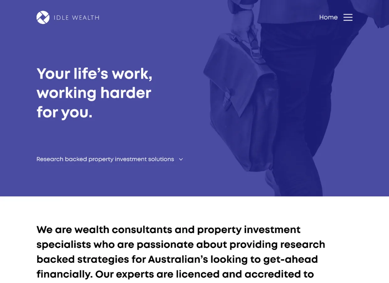
Your life's work, working harder
A responsive marketing website for an Australian property-investment and wealth advisory: a services offering, an education hub, and a lead-capture path that turns a curious visitor into a booked call, designed for desktop and mobile as one system.
Sector
- Property investment
- Wealth advisory
Deliverable
- Marketing website
- Desktop + mobile
What we did
- UX + UI design
- Responsive layout
- Design system
Reach
- Desktop
- Tablet
- Mobile
What is Idle Wealth?
A property-investment advisory sells trust before it sells a service. The website has one job: take a visitor who has never heard of the firm and move them, calmly, from a headline to a booked call - without ever feeling like a sales funnel.
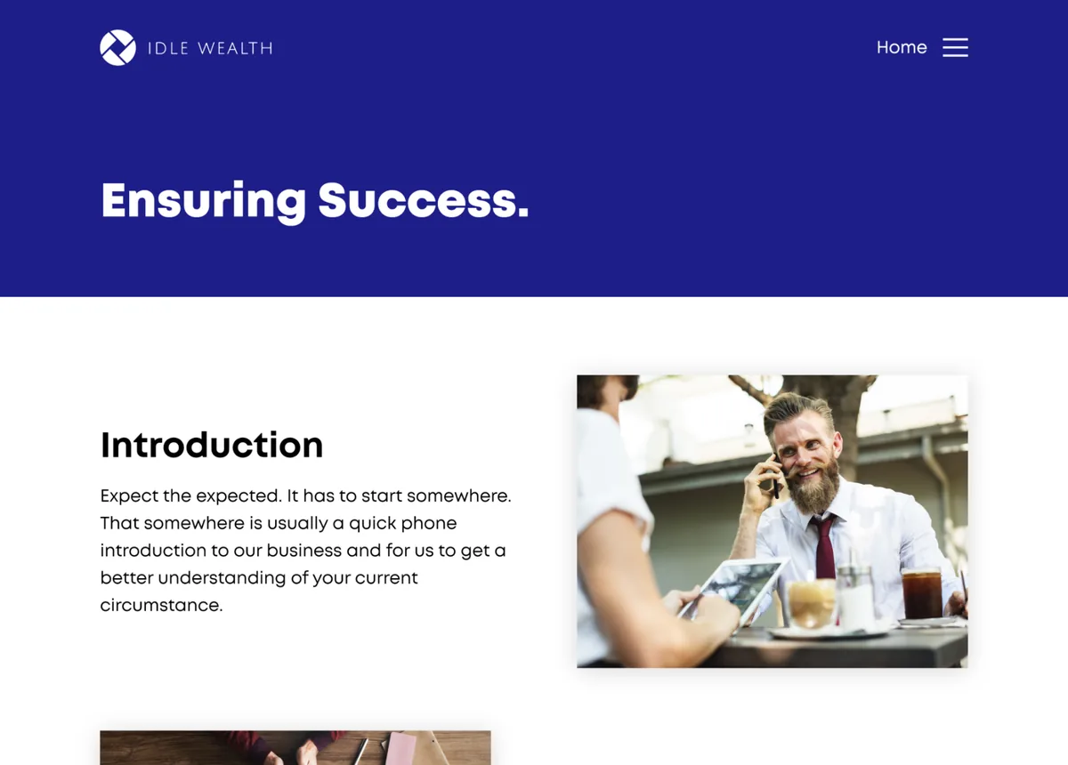
A site built around one journey
The home page leads with the promise, the middle explains the approach in plain language, an education hub answers the questions a cautious investor actually has, and a single, repeated call to action - book a call - is never more than a scroll away.
The advisory offering
8 servicesThe 'how can we help' section lays out the full advisory in one glance - so a visitor can find the service that fits their situation without reading a wall of copy.
- Property investment advice
- Mortgage broking
- Buyers agents
- Financial planning
SMSF & research
SpecialistSelf-managed super fund advice and property research are given their own billing, because they are the reasons a serious investor picks a specialist over a generalist.
- SMSF advice
- Property research
Education hub
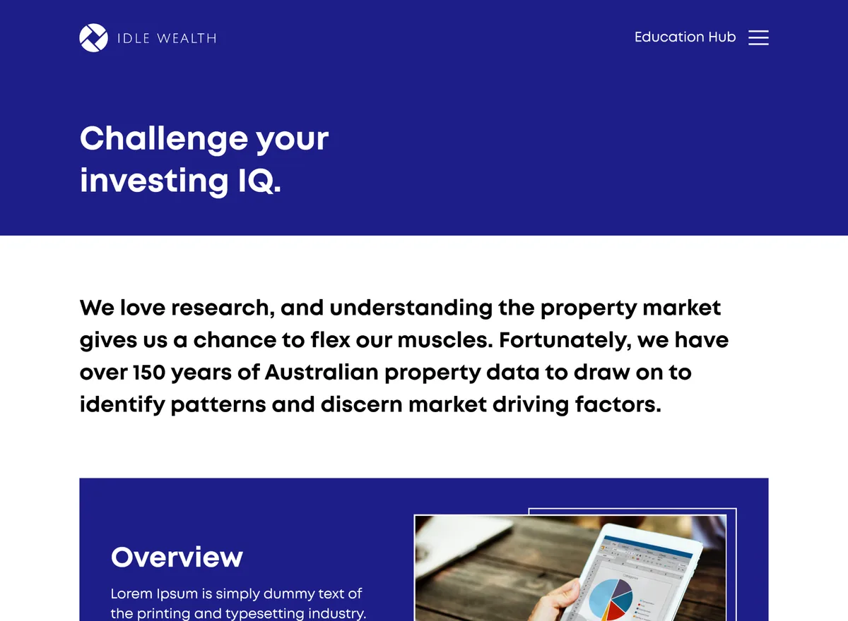
ContentA video-led education section gives the firm somewhere to publish research and build authority, and gives a cautious visitor answers before they ever fill in a form.
- Video library
- Research snippets
Lead capture
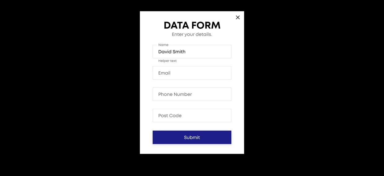
Book a callA recurring book-a-call and callback path threads through the page, backed by a data-capture form, so interest is converted at the moment it peaks rather than lost at the footer.
- Callback request
- Data form
- Affiliations
How did we design it?
A wealth advisory's site lives or dies on tone, so the work started with the story a nervous first-time investor needs to hear, then built the layout around it.
How does it hold up on mobile?
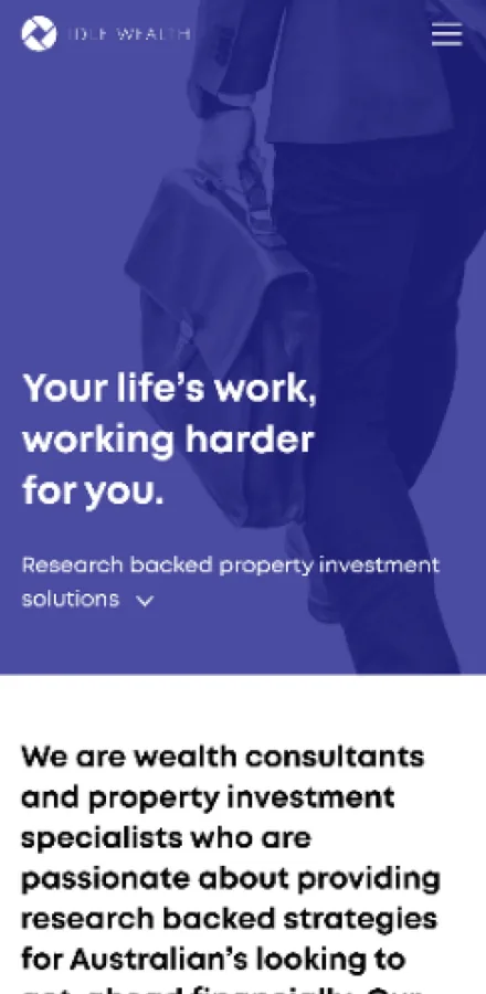
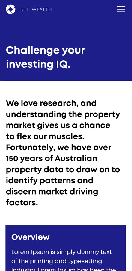
The site was designed for the phone as its own layout, not a squeezed desktop. Every surface - the home story, the education hub, the about page and the contact path - was drawn again at 360 wide with a dedicated mobile menu.
Home
The promise, the approach and the book-a-call action stack into a single readable column.
Education
The education hub reflows into a phone-friendly feed of research snippets.
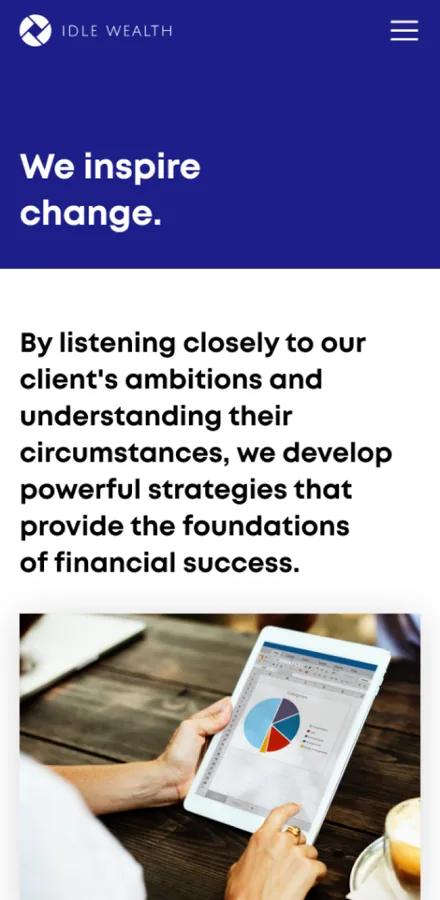
About
The firm's story and its people carry the same calm hierarchy on a small screen.
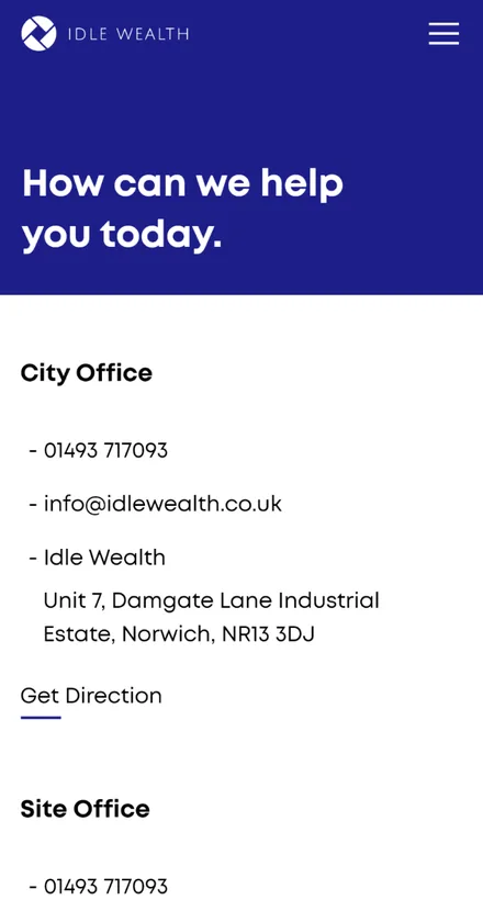
Contact
The contact and callback path is a single tap from the mobile menu.
What does an advisory website actually need?
Four things separate a professional-services site that books calls from a brochure that just sits there. They came out of designing this one and hold for most advisory firms.
- Trust before the pitch. A first-time investor needs to feel understood before they will read a service list, so the story leads and the credentials follow.
- Education as authority. A hub that answers real questions builds more confidence than any claim on a homepage, and gives the firm a reason to be found.
- One next step, repeated. A single call to action threaded down the page converts far better than five competing buttons at the footer.
- Mobile drawn on purpose. Most of this traffic is on a phone; a layout designed for 360 wide beats a desktop grid crushed to fit every time.
Building an advisory or wealth website
The questions professional-services firms ask us first, answered plainly.
Ask us yoursHow long does it take to build a marketing website like this?
A responsive marketing site of this shape - a story-led home page, a services offering, an education hub, a mobile layout drawn on purpose and a lead-capture path - is a matter of weeks rather than months, once the content and the tone are settled. What moves the date most is not the page count but how ready the copy and imagery are when design starts.
Do you design the mobile version separately?
Yes. For a site where most visitors arrive on a phone, we draw the mobile layout as its own design with its own menu and stacking order, rather than letting a desktop grid reflow on its own. Idle Wealth's home, education, about and contact screens were each designed again at phone width so the small-screen experience feels native.
How do you get a professional-services site to actually generate leads?
By building the whole page around one journey. The story earns trust first, the education hub answers the questions that precede a decision, and a single book-a-call path recurs down the page so interest is captured at the moment it peaks. Competing calls to action and a form buried in the footer are the usual reasons an advisory site looks good but converts nothing.
How much does a website like this cost?
It depends on scope, and no honest number comes off a page count alone. The biggest drivers are how many unique layouts are in scope, whether the mobile set is designed separately, and how much of the content and imagery the firm supplies. Shanti Infosoft scopes it on a short call and returns a fixed quote within 48 hours.
Related work
Have an advisory that deserves a better website?
Tell us how your business actually works and we will tell you honestly what it takes to build. See more of our work or what we do.
Book a 15-minute call