


One house,many brands.
An editorial, minimal website for a company that houses several consumer brands — a single, restrained identity that lets each brand it represents stand on its own.
A parent identity that stays out of the way
The site is deliberately restrained: a monochrome palette, an elegant serif display face and generous space. It presents the company, gathers a following through a newsletter, and routes visitors to the individual brands it houses — including its cakes and celebrations names — without imposing a loud identity of its own.
A portfolio of brands
A brands section introduces each consumer brand the company represents, giving them a shared front door.
An editorial, monochrome identity
Black, white and a serif display face keep the parent brand elegant and neutral so it never overshadows its brands.
An audience being built
A newsletter capture lets the company grow a following at the parent level, above any single brand.
What is a parent brand's website actually for?
A company that owns several brands needs a home that introduces all of them without competing with any of them.
Unique Concept Co. is exactly that — a quiet, confident parent site that hands the spotlight to the brands underneath it, including its cakes and celebrations names.
When a parent brand represents several others, colour is a distraction, so the identity leans entirely on typography and space instead.
What the parent site had to get right
A holding company's website has to introduce the business and hand the spotlight to the brands underneath it, without looking unfinished as more are added.
What it had to do
- Give every brand a shared front door. A brands portfolio section that can list one brand or many.
- Stay neutral. A monochrome, editorial identity that never competes with the brands it houses.
- Build an audience above any single brand. A newsletter capture at the parent level.
- Leave room to grow. A structure new brands can slot into without a redesign.
Why it was hard
- A parent identity with too much colour or character starts competing with the brands it represents.
- Each brand it houses — like RabbitHole Cakes & Celebrations — needs its own name and character to read clearly inside one shared shell.
- The structure has to hold more brands later, not just the ones live today.
Who does the site actually introduce?
One house, two real layers — the parent identity, and the brands it hands the spotlight to.
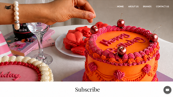
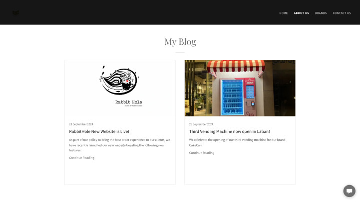
Unique Concept Co.
The monochrome, editorial home — homepage, about page and newsletter — that introduces the business without competing with any brand it houses.
RabbitHole Cakes & Celebrations
One of the consumer brands housed underneath it: a Riyadh-based cake business, with its own name, mark and description on the brands page.
How does a brand keep its own identity inside the shell?
The parent nav and layout stay constant; the brand supplies its own name, mark and copy inside it. Hover a pin to see where.
Home, About Us, Brands and Contact stay in place as a visitor moves from the parent site into a brand page.
RabbitHole's illustrated logo and wordmark sit untouched inside the parent's layout.
A brand heading and a short description carry the brand's own voice, not the parent's — “based in Riyadh, specialising in hand-made cakes.”
“Find out more” routes deeper into that specific brand.
Cake Can's section begins directly below in the same pattern, so the page can hold as many brands as the company adds.
The look, and why
Monochrome on purpose: when a parent brand represents several others, colour is a distraction, so black, white and a few greys carry everything, and an elegant high-contrast serif does the expressive work.
What we'd tell another brand house
Lessons from building a parent site meant to sit above more than one brand.
Let the parent recede
A restrained, often monochrome identity lets each brand underneath it keep its own colour and character.
Build the structure once
A brands portfolio that new brands can slot into is cheaper than retrofitting one designed for a single brand.
Grow the audience above the brands
A newsletter captured at the parent level compounds across every brand added later, not just the first one.
Building a multi-brand company website
How long does it take to build a company or brand website?
How should a parent brand look next to the brands it owns?
Can the site grow as we add more brands?
How much does a website like this cost?
Bringing several brands under one roof?
Tell us how your business actually works and we will tell you honestly what it takes to build.