


A token,told on one page.
A responsive marketing and token-sale website for TurnCoin and its platform, TheXchange: a single long-scroll page that has to carry a live price, the coin's structure, a whole sub-exchange concept and a buy call-to-action — and hold together across desktop, tablet and mobile.
One long scroll that has to do a lot
The page opens on the brand, a live token price and a buy call-to-action, then works through the idea, the coin's structure, the platform concept and the network of sub-exchanges it feeds — a marketing site, an explainer and a sales page at once.
Lead with price and a clear action
The brand, a live token price and a buy call-to-action sit at the top and recur down the page, so the one thing a visitor can do is never more than a scroll away.
Explain a layered concept in order
The idea, the coin's dual nature and the wider platform are staged as distinct sections, so a complex token model is read one step at a time rather than as a wall.
Show the ecosystem as a picture
The platform's network of sub-exchanges — sport, musician, actor, politician and business — is drawn as a single diagram around the core brand, so the structure lands at a glance.
Why is a crypto token site hard to design?
A token page has to build confidence and explain a novel model to a sceptical, skim-reading visitor, while carrying live market data and a sales action — and do all of it on one page that reads as well on a phone as on a wide monitor.
The token, the platform and a network of sub-exchanges are a lot to convey, so the page is sequenced into staged sections — idea, structure, ecosystem — that each carry one part of the story rather than dumping it all at once.
A live token price, the coin's structure and a price chart have to sit inside an editorial layout without turning it into a dashboard, so the market data is presented as a designed panel, not a table dump.
things the same page has to do at once — build trust, explain the token, and carry a live sale.
What Turn Coin had to get right
A token page has to build confidence and explain a novel model to a sceptical, skim-reading visitor — and do it on one page that reads the same on a phone as on a wide monitor.
One scroll, staged carefully
- Lead with price and a clear action — recurring down the page, always in reach.
- Explain the layered concept in order — idea, structure, platform, one step at a time.
- Show the ecosystem as one diagram — five sub-exchanges around the core brand.
- Hold together on every screen — designed at desktop, tablet and mobile.
Why it was hard
- A complex idea, one scroll — the token, the platform and a network of sub-exchanges are a lot to convey in sequence.
- Live data on a marketing page — price and structure had to read as a designed panel, not a dashboard.
- The same story on every screen — a long, image-heavy one-pager can fall apart on a phone if it is only drawn wide.
What does the opening frame actually carry?
The hero is doing several jobs at once — brand, live price, a buy action and the coin's own structure — all before the first scroll. Hover a pin to see what each part is doing.
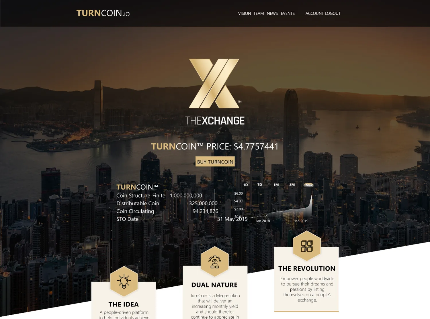
TurnCoin's identity sits over a skyline, setting the tone before any copy is read.
The price is set into the hero itself, not tucked away on a separate page — the market data is the opening argument.
A single buy call-to-action sits with the price, so the page's one sales action is visible from the first frame.
A panel below the fold sets out the coin's dual nature, staged as a designed block rather than a spec sheet.
A price chart across multiple ranges sits beside the structure panel, carrying market data without turning the hero into a dashboard.
The skyline backdrop gives the token real-world scale, rather than floating the brand on a flat colour field.
What is a visitor actually being told, scroll by scroll?
The one-page layout reads like an answer to a running set of questions — here is that conversation, staged the way the page itself is staged.
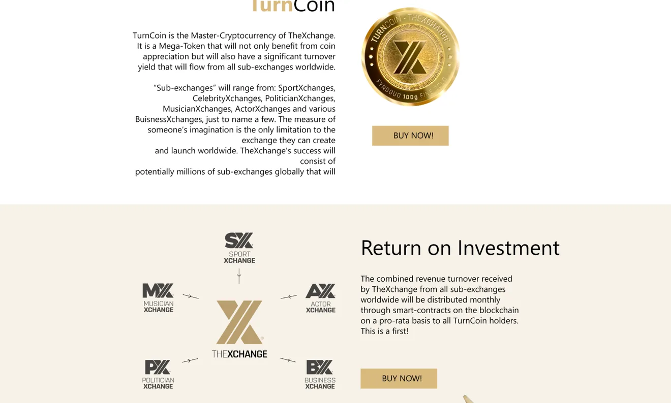
The platform as one diagram, not a paragraph.
The core token sits at the centre of a diagram of sub-exchanges — sport, musician, actor, politician and business — so the network the token feeds is understood in a glance rather than a bullet list.
The scope, in one panel
Every number in this panel is delivered scope — what was designed, built and handed over on the fintech / crypto build for Turn Coin. It leaves out traffic, conversion and revenue on purpose: those figures belong to the client, and we don’t publish numbers we cannot stand behind.
- Sector
- Fintech / cryptoToken marketing
- Product
- One-page siteLive price + buy CTA
- Our work
- Product + UI designResponsive build
- Breakpoints
- Desktop · TabletMobile
The same story, reflowed
A long, image-heavy one-pager is exactly the layout that falls apart on a phone if it is only drawn wide — so the narrative order and the buy action were designed to survive the reflow.
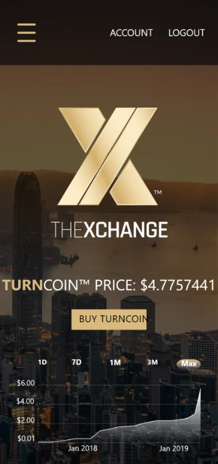
Designed at three breakpoints. Desktop, tablet and mobile each carry the same brand, price and buy action, just reflowed.
The look, and why
A black-and-gold system built for a fintech audience — dark panels let the live price and chart read as data, while a warm gold carries the brand and the one buy action down the page.
What does any token or fintech landing page need?
Five risks apply to any page that has to explain a novel model and sell it on the same scroll — here is how each was handled on Turn Coin.
Explain the concept
Staged sections, one idea each — not a wall of text nobody reads.
Show the tokenomics
A designed structure-and-price panel — not a spreadsheet dropped on a landing page.
Show the ecosystem
One diagram of sub-exchanges around the core — not a bullet list of names.
Drive the action
Price and buy recurring down the scroll — not a button lost at the top.
Work on a phone
Designed at three breakpoints — not a desktop page crushed small.
Designing a crypto or token website
How long does it take to design and build a crypto token website?
How much does a token or fintech marketing site cost?
Can you present tokenomics and live price data clearly?
Launching a token or a fintech product?
Tell us how your business actually works and we'll tell you honestly what it takes to build — the live data, the concept, the buy flow. No deck, no pitch.