


Care you can actually filter
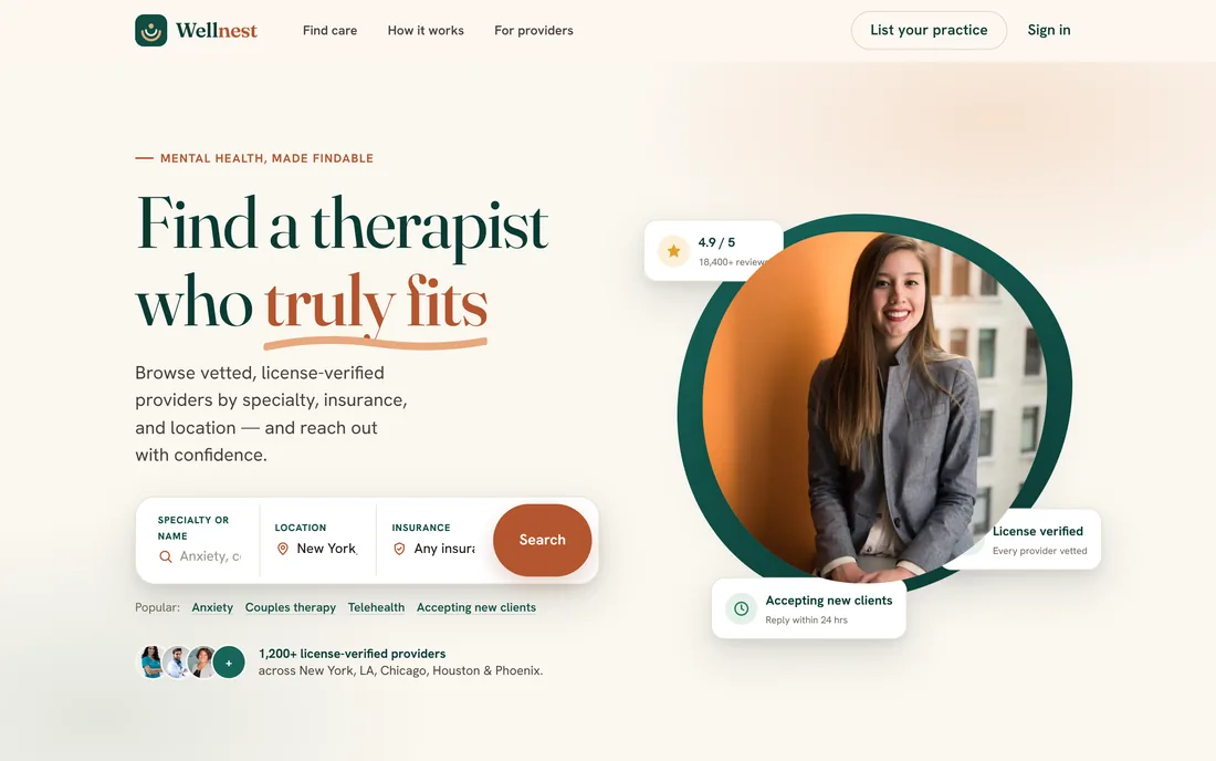
A mental-health provider directory: search by specialty, insurance plan, visit type and availability, then read a full practitioner profile with verified credentials, session pricing and dated reviews before making contact.
Sector
- Healthcare marketplace
- Mental health
Capability areas
- Search + filtering
- Profiles + paid listings
What we did
- Product modelling
- Brand + UI system
- Front-end build
Two audiences
- People seeking care
- Listed practitioners
What is Wellnest for?
Finding a therapist is a search with three hard filters - do they treat what I have, do they take my insurance, are they taking anyone new - and most directories answer none of them until you have already made contact.
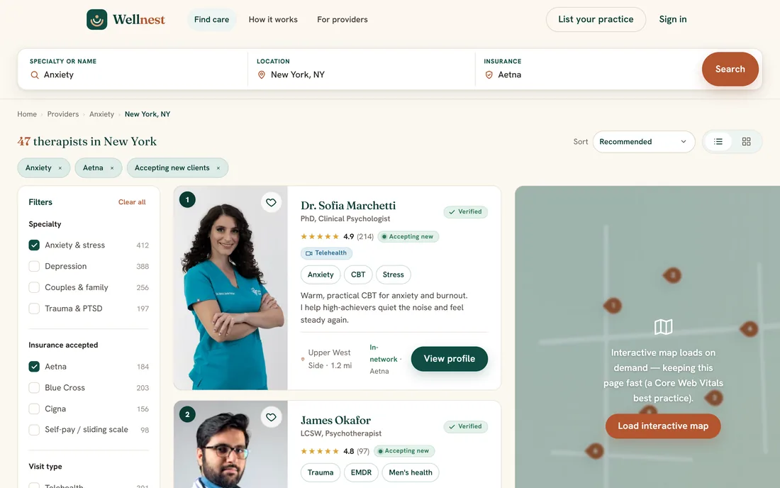
A directory that answers the disqualifying questions first
Wellnest is built around a single idea: put the things that would rule a provider out on the card, not behind an enquiry form. Specialty, plan, visit type, distance and whether they are accepting new clients all filter the list before anyone writes a message they may not need to send.
Why are healthcare directories so hard to trust?
The failure modes of a provider directory are well known and unusually costly, because the person searching is often at their least resilient. Three of them shaped every screen in Wellnest.
| What a searcher needs to know | A typical listing site | In Wellnest |
|---|---|---|
| Do they treat what I have? | A long free-text bio to read | Specialty filters with the count of matching providers |
| Do they take my insurance? | "Contact for details" | Plan filter, with in-network status on the result card |
| Are they taking new clients? | Found out by emailing | An accepting-new-clients filter and badge |
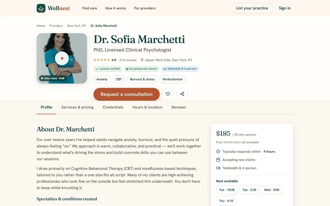
| What will it cost? | Not published | A services and pricing block per session type |
| Are they actually licensed? | Letters after a name | A licence-verified badge with the issuing detail on the profile |
| Can I try before committing? | Book a full paid session | A free short intro call listed as its own service |
What can you actually click?
Three screens, deliberately - the whole journey a person takes from arriving with a vague need to reading one practitioner's profile in enough detail to decide.
What does a healthcare directory have to get right?
Six things came out of building this. They apply to any two-sided directory where one side is a regulated professional and the other side is deciding under stress.
- Put the disqualifiers on the card. Insurance, availability and visit type end most enquiries, so they belong in the list view rather than behind a form.
- Verify, then badge - never the reverse. A trust mark the platform cannot stand behind is worse than no trust mark at all, particularly in health.
- Show counts on every filter. A filter that silently returns nothing teaches people the directory is empty; a count sets the expectation before the click.
- Publish price, and say who owns the caveat. Fees can be listed honestly while still stating plainly that coverage must be confirmed with the provider.
- Give the professional a reason to maintain the profile. Claimed listings, profile insights and a membership tier are what keep a directory from going stale.
- Design the contact step for hesitation. A free short intro call converts far better than a booking button when the decision is an emotional one.
What does the interface look like, and why?
Deep pine carries the calm and the credibility; a warm clay is reserved for the moment a person reaches out, so the one bright thing on the page is always the action. Sand and cream keep a health product from reading as clinical.
Aa
Primary typeface
Fraunces
A B C D E F G H I J K L M N O P Q R S T U V W X Y Z
a b c d e f g h i j k l m n o p q r s t u v w x y z
0 1 2 3 4 5 6 7 8 9 & ? ! £ $ €
44pxFind a therapist who truly fitsH132pxCare for what you're facingH220pxPractitioner name on a cardH318pxLead copy under a headingLead16pxBody text, filters and profile detailBody13pxMENTAL HEALTH, MADE FINDABLEEyebrowDisplay sizes are shown here at their settled desktop values - the interface sets them fluidly, so they scale down on smaller screens. Fraunces and Hanken Grotesk are open-licence typefaces; the specimen above falls back to the nearest available face if they are not installed on your device.
Building a healthcare directory platform
What founders ask us first about two-sided directories, answered plainly.
Ask us yoursHow long does it take to build a provider directory platform?
A first production version of this shape - search and filtering, provider profiles, claiming and a membership tier - is a matter of months rather than weeks. The work that moves the date is rarely the search screen. It is provider onboarding, the verification process behind the badge, and the billing and permissions that come with paid listings.
How do you verify a healthcare provider's licence?
By checking the licence number against the issuing board's own register, and re-checking it on a schedule rather than once at signup. The product decision that matters is what the badge means: Wellnest verifies the licence itself, and marks separately whether the practitioner has claimed and is managing the profile. Two different facts, two different marks.
How does a directory make money without charging patients?
Wellnest uses the common pattern: listings are free to browse and free to claim, and practitioners pay for a membership tier that adds visibility, profile insights and enhanced presentation. It is worth making the free tier genuinely useful, because a directory with thin coverage has nothing to sell in the first place.
What makes a healthcare marketplace different from a general one?
The consequences of a bad match, and the regulation around who may claim what. Credentials have to be verified rather than self-declared, coverage and cost claims need caveats the platform can stand behind, and the tone of the interface matters more than usual because people arrive at a low point. None of that is a feature list - it is a set of constraints on every screen.
How do you stop a directory going stale?
By giving the professional a reason to come back. A claimed listing with profile insights - views, saves and enquiries - plus a membership tier turns profile maintenance into something the practitioner wants to do. On the searcher's side, an accepting-new-clients state the provider can switch off in one tap is worth more than any freshness algorithm.
Related work
Building a directory or marketplace?
Tell us how your business actually works and we will tell you honestly what it takes to build. See more of our work or what we do.
Book a 15-minute call