


Brokerage, agent, closing
A revenue dashboard for a residential brokerage. Commission against target, agent performance and every listing sit on one filtered screen - and every chart, bar and row is a door into the level below it.
Sector
- Residential real estate
- Brokerage operations
Platform
- Web analytics console
- 3 drill-down levels
What we did
- Metric modelling
- Data-visualisation design
- Front-end engineering
Analysis axes
- Year
- 5 property types
- 5 regions
What problem does it solve?
Brokerage reporting usually arrives as a monthly export that answers the question someone asked last month. The interesting questions are comparative, and they only surface when you can move between levels quickly.
One screen that answers three different jobs
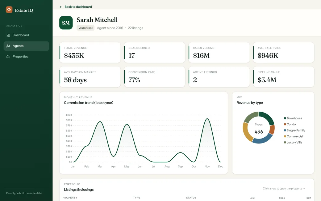
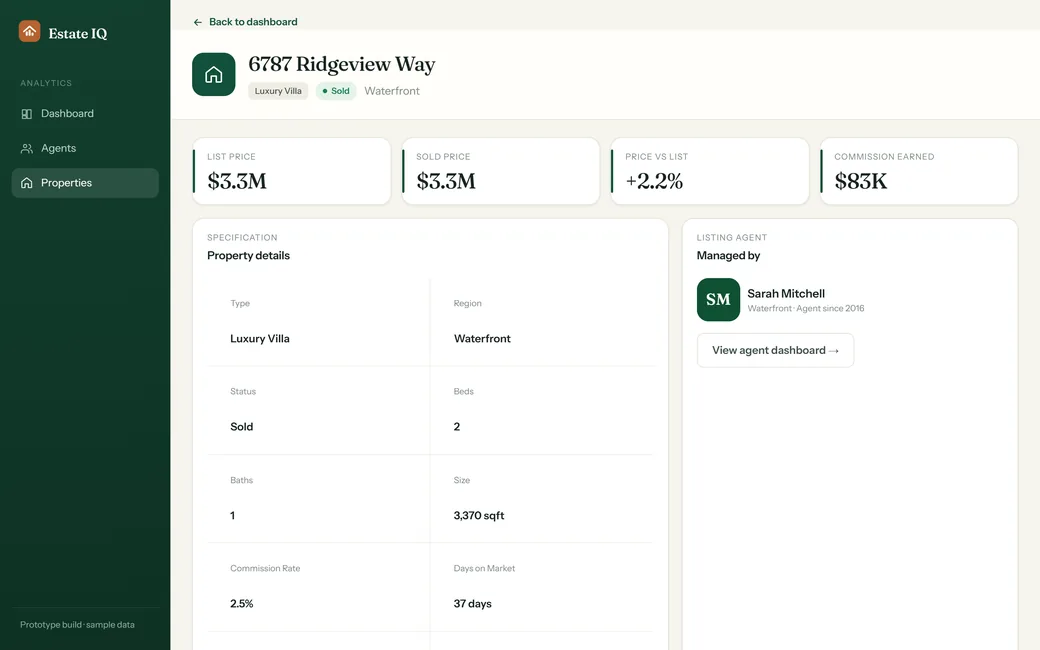
A principal wants the brokerage number. A sales manager wants to know which agent is carrying it. An agent wants their own pipeline. Rather than three reports, Estate IQ puts one filtered dashboard at the top and lets a click take you down to a single agent, then to a single closing - with the filter context carried the whole way.
Why is brokerage reporting hard to get right?
Three things break most attempts at a real-estate dashboard: the headline numbers hide the distribution, the same record has to be read from several angles, and performance conversations need evidence rather than a ranking.
How did we build it?
The build ran outwards from a single decision: what is the smallest set of numbers a brokerage principal actually acts on, and what does each of them need to open into?
How is the dashboard laid out, and why?
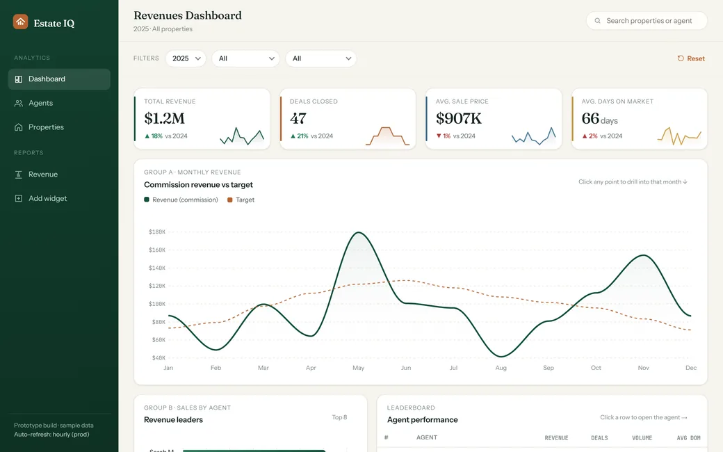
Estate IQ puts the whole brokerage on a single filtered surface. This is that screen as it renders - select a pin to see what each region does and the reasoning behind where it sits.
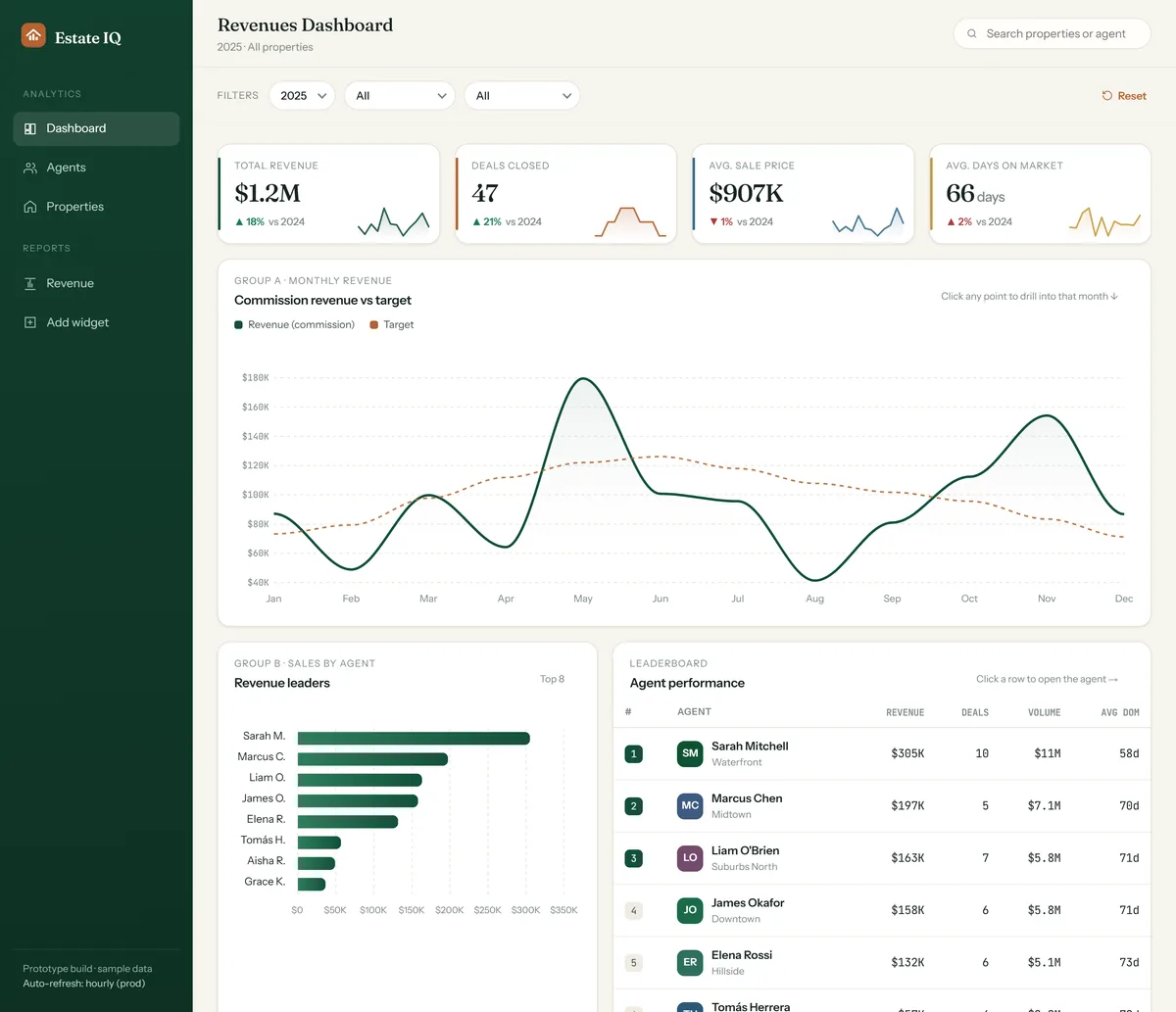
Dashboard, agents and properties are the only navigation. Everything else is reached by drilling, which keeps the rail short and means the structure of the data is learned by using it rather than by reading a menu.
Year, property type and region live in a fixed strip at the top of the page. One change recomputes the KPI row, all three chart groups, the leaderboard and the detail table at once, so comparisons stay honest.
Total revenue, deals closed, average sale price and average days on market carry a year-on-year delta and a sparkline. The colour-coded left edge ties each card to its series elsewhere on the page.
"Click any point to drill into that month." Drill-downs are invisible unless you say so, and a hint in the card header costs nothing while removing the single biggest reason people never find the depth in a dashboard.
Group A plots commission revenue as a solid line against a dashed target. Plotting the goal in the same space is what turns a trend into a judgement - and each point opens the month behind it.
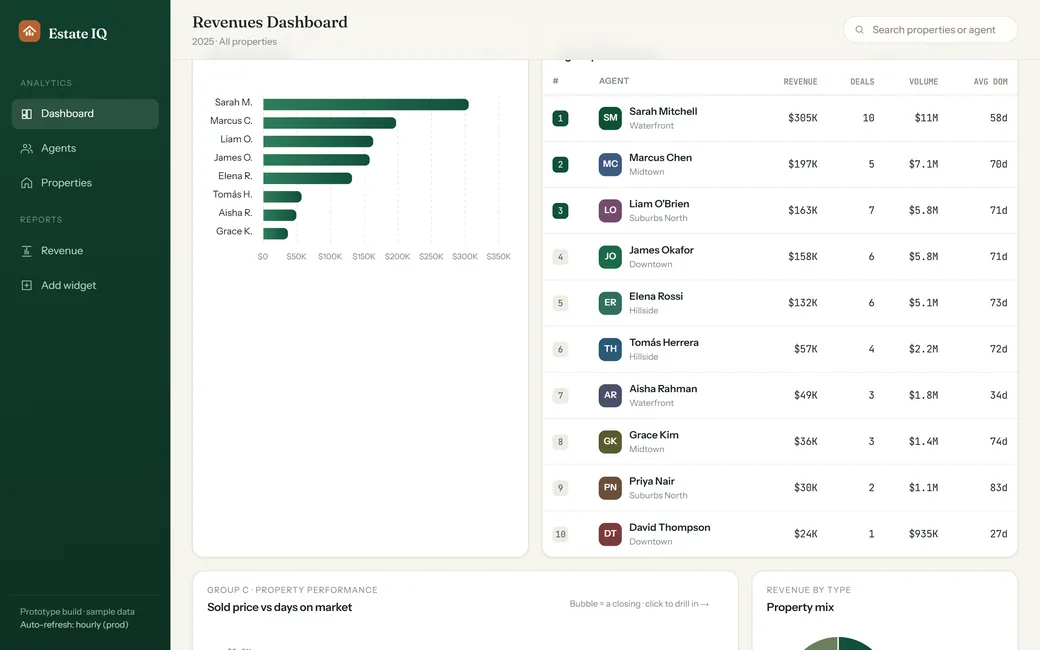
Group B ranks agents as a horizontal bar chart. Reading the drop-off between first and eighth is instant here and slow in a table, which is why both views sit next to each other rather than one replacing the other.
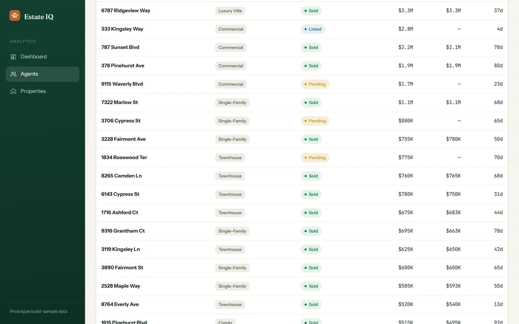
Each row carries revenue, deals, sale volume and average days on market, and opens a full agent view with eight measures, a monthly trend, a revenue mix and their whole portfolio of listings and closings.
What does the interface look like, and why?
Estate IQ is deliberately not a blue SaaS dashboard. A deep forest green carries the structure, warm bone and paper replace the usual cold grey, and copper is reserved for a destructive or resetting action - so the palette reads closer to a property brochure than to an admin panel, without giving up the density the data needs.
Aa
Primary typeface
Fraunces
A B C D E F G H I J K L M N O P Q R S T U V W X Y Z
a b c d e f g h i j k l m n o p q r s t u v w x y z
0 1 2 3 4 5 6 7 8 9 & ? ! £ $ €
30px$1.2MKPI figure22pxRevenues DashboardPage title16pxCommission revenue vs targetCard heading15pxBody copy and navigation itemsBody14pxTable cells and detail rowsTable12pxTOTAL REVENUE · AVG DOMLabelThese values are read from the running product's own design tokens rather than sampled off a screenshot. Money and duration columns are set in a monospaced face with tabular figures so a column of prices lines up on the decimal - the detail that lets a leaderboard be scanned rather than read. Fraunces, Instrument Sans and JetBrains Mono are open-licence typefaces; the specimen above falls back to the nearest available face if they are not installed on your device.
Building a real-estate analytics platform
The questions brokerages and proptech teams ask us first, answered plainly.
Ask us yoursHow long does it take to build a real-estate analytics dashboard?
A first production release at roughly this scope - a filtered brokerage dashboard, agent views, property records and export - is a matter of months rather than weeks. The dashboard itself is rarely the long pole. What moves the date is agreeing the definition of each measure, and getting clean commission, listing and closing data out of whatever system currently holds it.
Can it read data from our existing CRM?
Yes, and that is normally how it is built. A dashboard of this kind sits on top of the systems a brokerage already runs, pulling listings, closings, agents and commission records on a schedule rather than asking anyone to re-enter them. The integration work is proportional to how consistent the source data is, not to how many charts are on screen.
How much does a custom brokerage dashboard cost?
It depends on scope, and a feature list alone is not enough to quote from honestly. The main cost drivers are the number of source systems, how much historical data has to be reconciled, and whether agents get their own logins alongside management. Shanti Infosoft scopes it on a short call and returns a fixed quote within 48 hours.
Why build a custom dashboard instead of using a BI tool?
A general BI tool is the right answer when analysts are the audience. It is the wrong answer when the audience is a principal and ten agents who will use it between viewings. Purpose-built means the vocabulary is theirs, the drill path matches how they actually reason about a deal, and nobody has to learn a query builder.
Can agents see only their own numbers?
That is a standard requirement and a straightforward one to model. The same data can be scoped so that management sees the brokerage, a sales manager sees a region, and an agent sees only their own listings, closings and pipeline - with the drill path staying identical at every level of access.
Related work
Reporting that arrives a month late?
Tell us how your business actually works and we will tell you honestly what it takes to build. See more of our work or what we do.
Book a 15-minute call