


Learn themarkets.
A membership portal for people learning to trade. Market news, articles, seminars, market-insight write-ups, strategy libraries and video courses live in one dashboard, gated across four tiers so a member sees exactly what their plan includes.
One dashboard, four tiers
Every member logs into the same dashboard. What is open and what is locked depends on their tier, and the padlocks fall away one group at a time as they upgrade from free to diamond.
Access is the product
The tier a member is on decides which modules are unlocked, so the same dashboard is a different product at free and at diamond.
Content in categories
Market news, articles, seminars, market opportunities, trading strategies, video courses and future-trends analysis each get their own module.
A clear path to upgrade
Locked modules show what a member is missing, with an upgrade path and unlock flow that make the next tier obvious.
Why gate learning content by tier at all?
A membership business lives or dies on whether the value of the next tier is obvious. The hard design problem is showing a member what they don't have without making the app feel mean.
Locked has to look worth it. A padlock on its own frustrates. A locked module should read as an invitation rather than a wall — visible in the dashboard itself, not just on a pricing page shown once.
Four tiers, one interface. Free, silver, gold and diamond can't be four separate apps; they are one dashboard that reveals more of itself, with per-module unlock rather than an all-or-nothing switch.
Upgrading has to be one step. If the path from locked to unlocked is buried behind a separate checkout, nobody climbs. Unlock and upgrade sit right where the lock is.
things had to be designed at once — a lock that reads as an invitation, one interface for four tiers, and an upgrade that's one step away.
What X TradingFloor had to get right
The hard design problem was showing a member what they don't have without making the app feel mean — and making the next tier's value obvious inside the dashboard itself.
Make the lock an invitation
- Make locked modules sell. A padlock in the sidebar reads as an invitation, not a wall.
- Keep it one interface. Free, silver, gold and diamond are one dashboard that reveals more of itself.
- Put the upgrade beside the lock. Unlock and upgrade sit right where the lock is, not behind a separate checkout.
- Make the free tier genuinely usable. News and articles are real content, not a teaser.
Why it was hard
- A padlock on its own frustrates — it had to communicate value, not just restriction.
- Four tiers can't become four separate apps without fragmenting the product.
- A buried upgrade path means nobody climbs, so unlock and upgrade had to sit beside every lock.
- Seven content modules had to stay browsable and consistent instead of turning into clutter.
How much you see depends on your tier
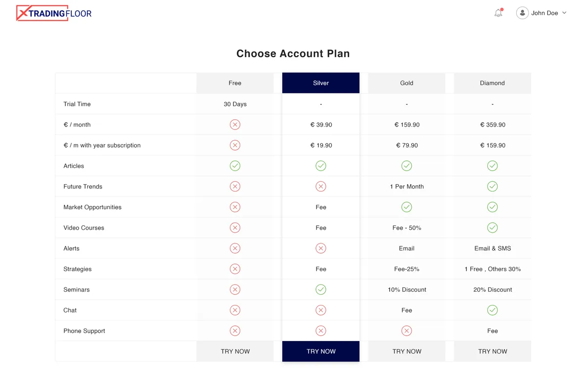
Free, silver, gold and diamond are the same dashboard with more unlocked — the padlocks in the sidebar tell the whole story.
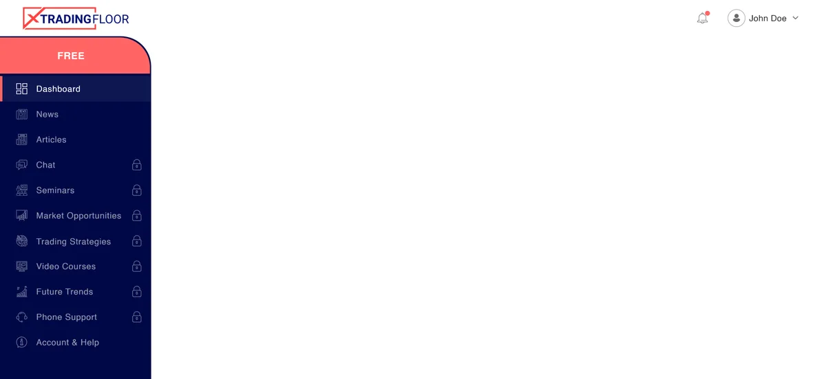
Free tier
News and educational articles are open; the live-market modules stay locked.
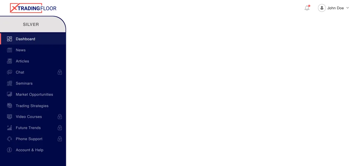
Silver tier
Unlocks seminars, market opportunities and trading strategies on top of the free tier.
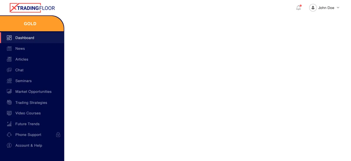
Gold tier
Adds member chat, video courses and future-trends analysis.
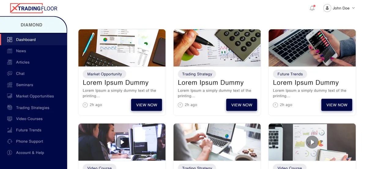
Diamond tier
Everything unlocked, including one-to-one phone support.
What is behind the tiers?
Six of the portal's content modules, from the always-open reading tier to the upgrade flow that moves a member between plans.
News & articles
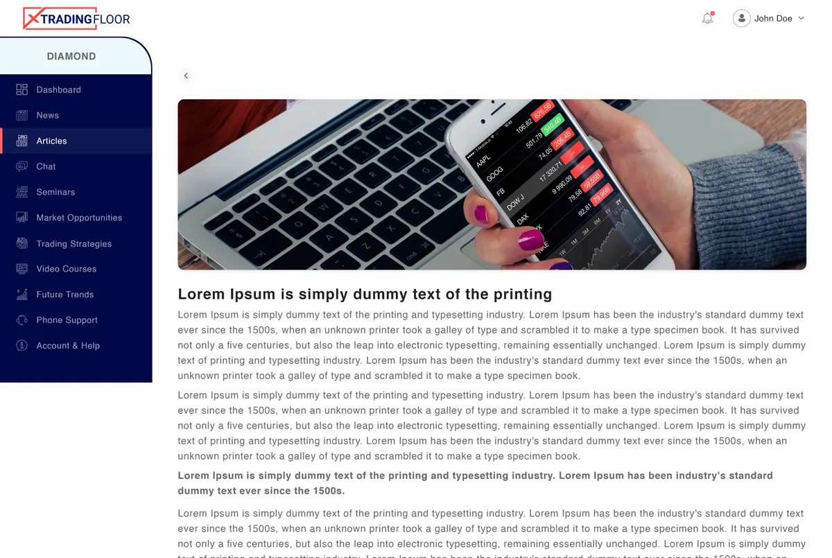
Open tierThe always-open reading tier: market news and educational articles available to every member whatever their plan.
Seminars
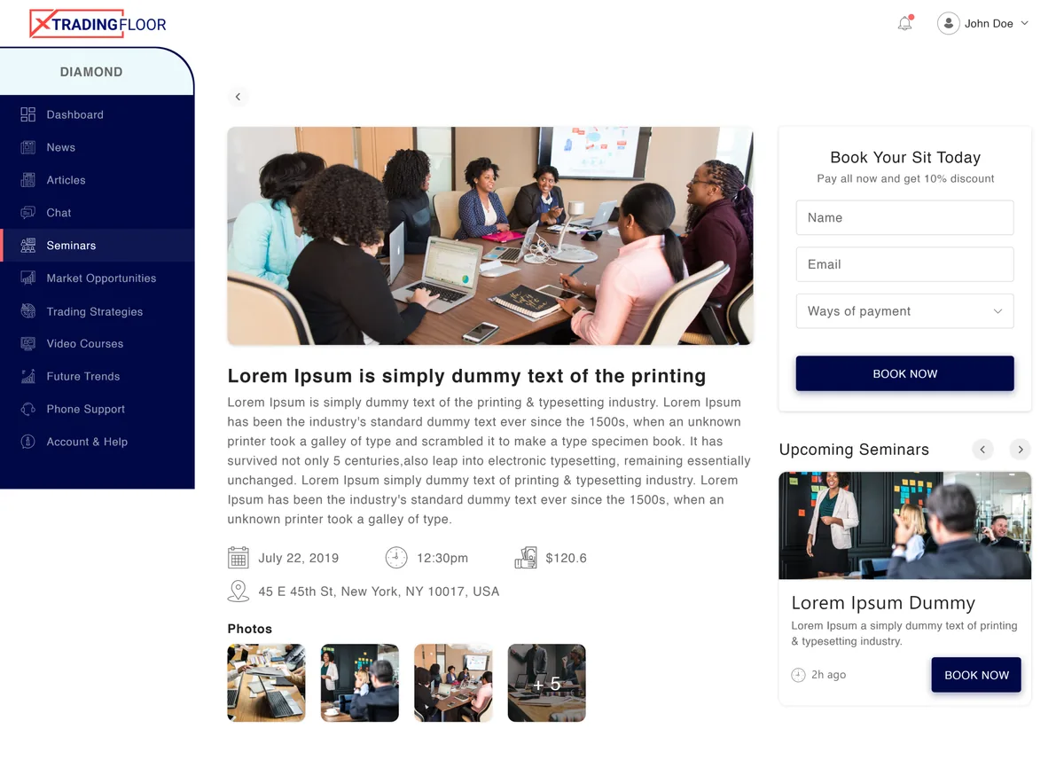
SessionsScheduled educational seminars a member can browse and book, with upcoming and past views.
Market opportunities
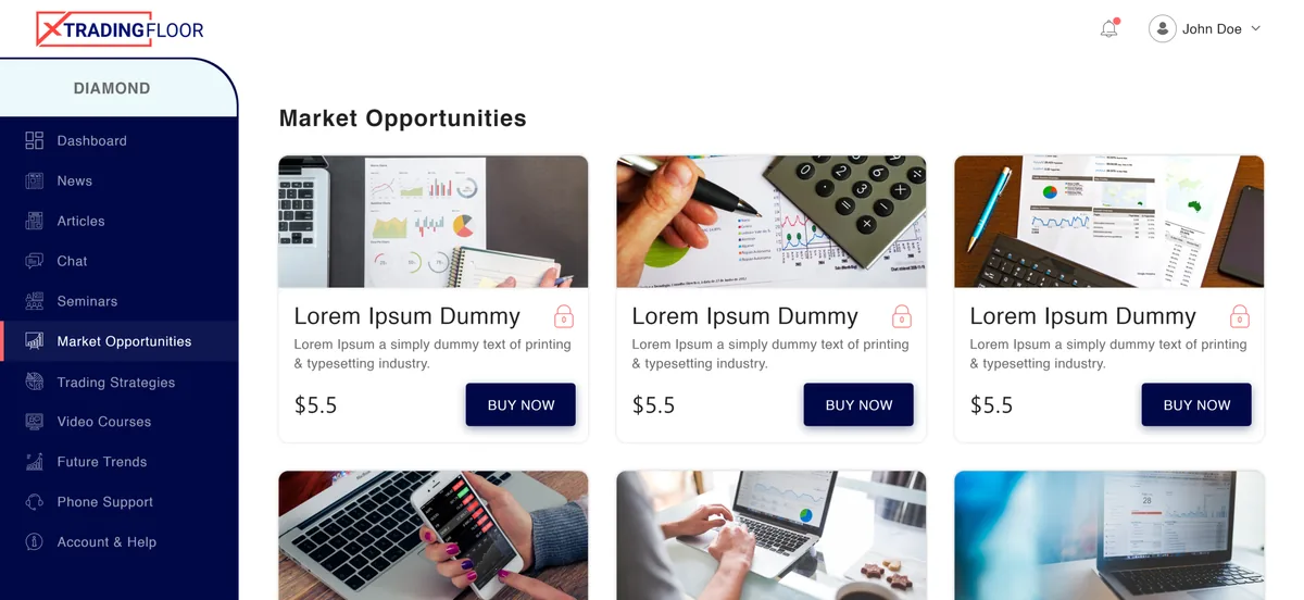
InsightA feed of market-insight write-ups a member unlocks to read at the higher tiers.
Trading strategies
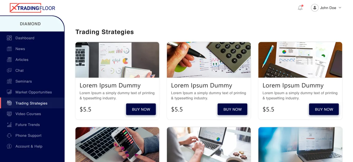
LibraryA library of strategy write-ups a member can study, unlocked per item or by tier.
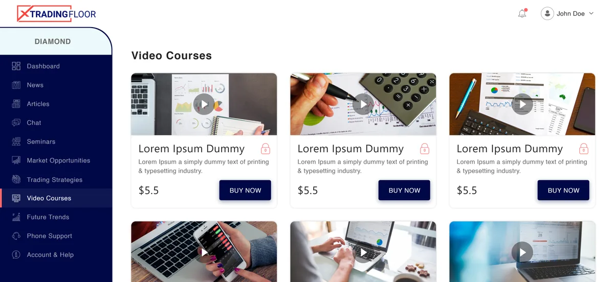
Video courses
LearningOn-demand video courses that teach the material, unlocked at the upper tiers and played inside the portal.
Plans & upgrade
MembershipA clear upgrade path between free, silver, gold and diamond, with per-module unlock and purchase flows.
How was the portal designed and built?
A tiered membership is really an access model wearing a content site. The design started from which tier unlocks what, then made that ladder visible everywhere.
- 01Team
Design the tier ladder
We mapped exactly which modules each of the four tiers unlocks, because that ladder is the whole commercial model.
- 02Team
Make locked modules sell
Locked items stay visible in the sidebar with a padlock, so a member always sees the value a tier away.
- 03Team
Put upgrading one click away
Unlock and upgrade flows sit beside the lock, turning a blocked click into a clear purchase decision.
- 04Team
Organise the content
Seven module types were designed as consistent, browsable feeds, so more content never turns into more clutter.
The scope, in one panel
Every number in this panel is delivered scope — what was designed, built and handed over on the trading education build for X TradingFloor. It leaves out traffic, conversion and revenue on purpose: those figures belong to the client, and we don’t publish numbers we cannot stand behind.
- Industry
- Trading educationMembership content
- Platform
- Membership portalWeb dashboard
- Tiers
- Free · SilverGold · Diamond
- What we did
- UX & UI designFront-end build
Future trends, bundled into the top tiers
Longer-horizon analysis content sits alongside the rest of the module library, bundled into the upper tiers.
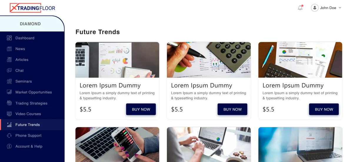
Future trends. Longer-horizon analysis content bundled into the upper tiers.
The look, and why
A decisive red marks locks and calls to upgrade, a deep navy grounds the dashboard, and a clean grotesk keeps dense module lists and tier labels legible.
What does a tiered-access product need to get right?
X TradingFloor forced these decisions, but the pattern carries to any product that gates content or features by plan.
Show the lock, not just the wall
A locked module stays visible with a padlock rather than disappearing, so it communicates value instead of just restriction.
One interface, more of itself
Tiers can't become separate apps — the same dashboard should simply reveal more as a member upgrades.
Put the upgrade beside the lock
If the path from locked to unlocked is buried behind a separate checkout, nobody climbs.
Keep the free tier genuinely useful
A free tier that's a real, usable product earns trust that a teaser never does.
Let the pattern absorb new content
Each module is a consistent, browsable feed, so a new category slots in and can be assigned to whichever tiers should carry it, without redesigning the dashboard.
Building a tiered membership platform
How does a tiered membership portal work?
What is the difference between the free and paid tiers?
How is access controlled per tier?
Can the content categories be extended?
How long does it take to build a membership platform like this?
Building a membership or subscription product?
Tell us how your business actually works and we'll tell you honestly what it takes to build — the tier ladder, the unlock flows, the modules. No deck, no pitch.