


Connecting teamsto wealth.
A marketing and education website for a consultancy that trains sales and fundraising teams to grow in the ultra-high-net-worth market. A brand-led home, a five-step referral methodology laid out step by step, and a page for each industry it serves.
Three pillars, one page to explain them
The home page leads with what the firm actually offers — education, prospect development and training — then splits its audiences into enterprise engagements and individual professionals, before pointing everything at the methodology that makes the case.
Education
Insight into how the ultra-affluent think, invest, buy and give — the understanding a team needs before it can win that market, presented as the firm's first pillar.
Prospect development
The delivery of a portfolio of qualified, accessible high-net-worth prospects, framed on the site as a service rather than a promise — a pipeline, not a list.
Training
Methodological training on efficiently turning identified prospects into paying clients and donors, tied directly to the five-step method the site lays out.
How do you sell a methodology on a website?
The firm's product is a way of working, and a discreet, relationship-led market judges a consultancy on how it carries itself. Three things shaped the design: a method that has to be taught, two very different buyers, and a brand that has to read as credible without shouting.
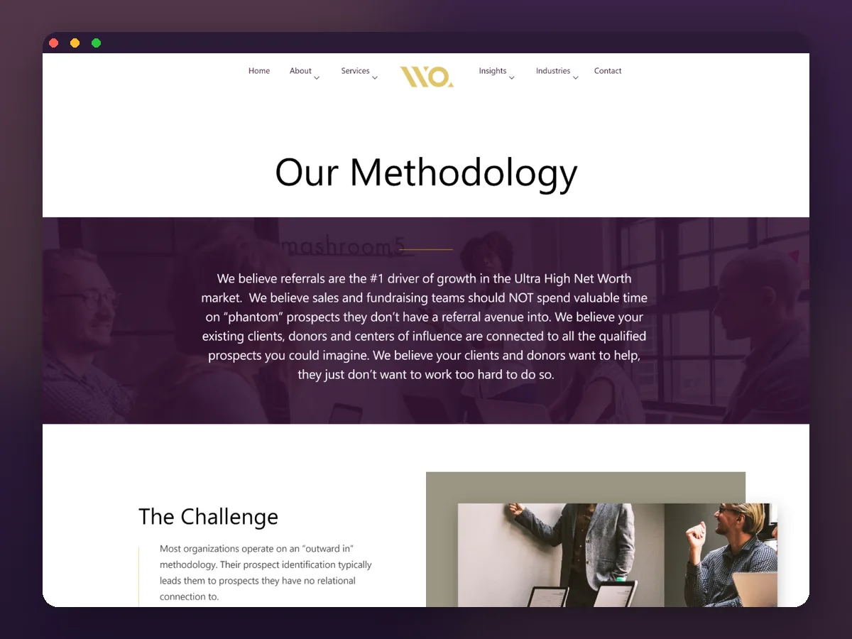
The method is the product. A visitor is not buying a feature, they are buying a way to grow — outward-in prospecting chases people with no connection to the team, where the method starts inside relationships they already hold. So the methodology page carries as much design weight as the home page.
Two very different buyers. An enterprise team and an individual sales professional want different things, so the home page splits cleanly into enterprise engagements and an online-university path, each seeing their own route without a separate site.
Credible, not loud. The ultra-high-net-worth market is relationship-led and restrained, so a deep aubergine and gold palette, generous space and quiet typography make the site read as a trusted advisor rather than a sales funnel.
things shaped the design — a method that has to be taught, two very different buyers, and a brand that has to read as credible without shouting.
What the WealthQuotient site had to get right
The firm's value is a proprietary method, not a feature list — the site had to teach it, route two different buyers correctly, and read as a trusted advisor rather than a sales funnel.
Teach the method, not just list services
- Give the methodology its own page — as much design weight as the home page, not a paragraph on an about page.
- Split the two buyers cleanly. Enterprise engagements and an online-university path, each with its own route.
- Lead with the three pillars. Education, prospect development and training, understood within one screen of scrolling.
- Read as restrained, not promotional. A disciplined palette and quiet typography over noise and decoration.
Why it was hard
- A visitor is not buying a feature — the site has to argue a thesis and then teach a five-step method.
- An enterprise team and an individual professional want different things from the same home page.
- A relationship-led, discreet market judges a consultancy on how it carries itself, not on how loudly it sells.
- Four industry pages had to show one method applied consistently, not four different pitches.
Who is the WealthQuotient site built for?
Two buyers, one home page — an enterprise team and an individual sales professional, each routed to their own path without a separate site.
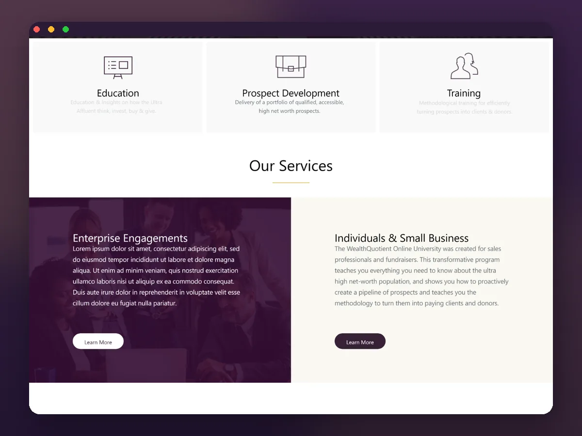
The enterprise team
Wants an engagement — the home page routes enterprise visitors straight to that path, distinct from the individual route.
The individual professional
Wants a way in on their own, routed to an online-university path rather than an enterprise engagement.
What does the website look like?
The pages that carry the brand and the argument, from the home page to the methodology that anchors the whole proposition.
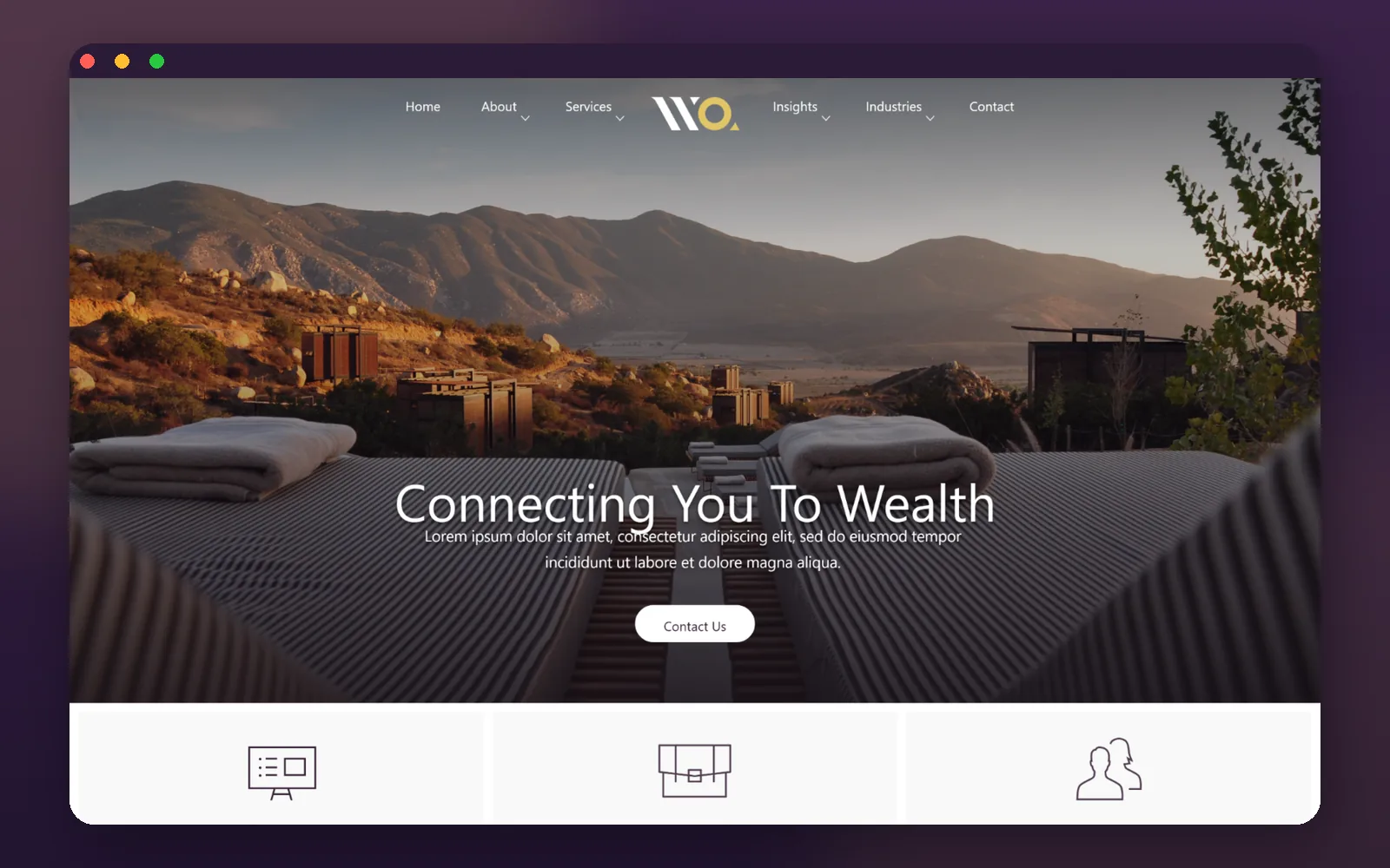
A home that opens on the promise
Home · The brandA full-width landscape, a single line — connecting you to wealth — and one call to action set the tone before the three pillars appear directly beneath.
Education, prospect development, training
Pillars · The offeringThe three pillars sit immediately under the hero as equal cards, so a visitor understands what the firm does within a single screen of scrolling.
Five steps, laid out to be read
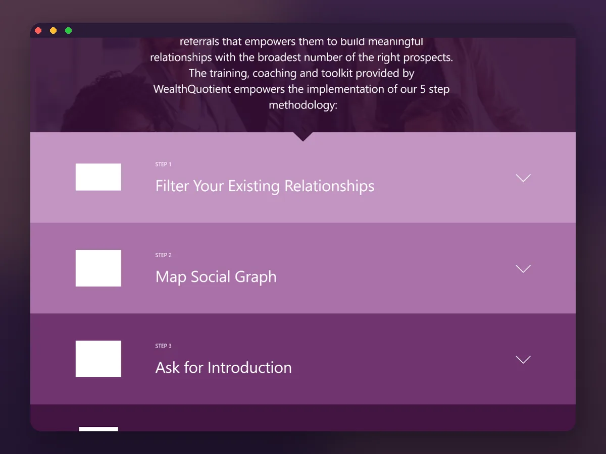
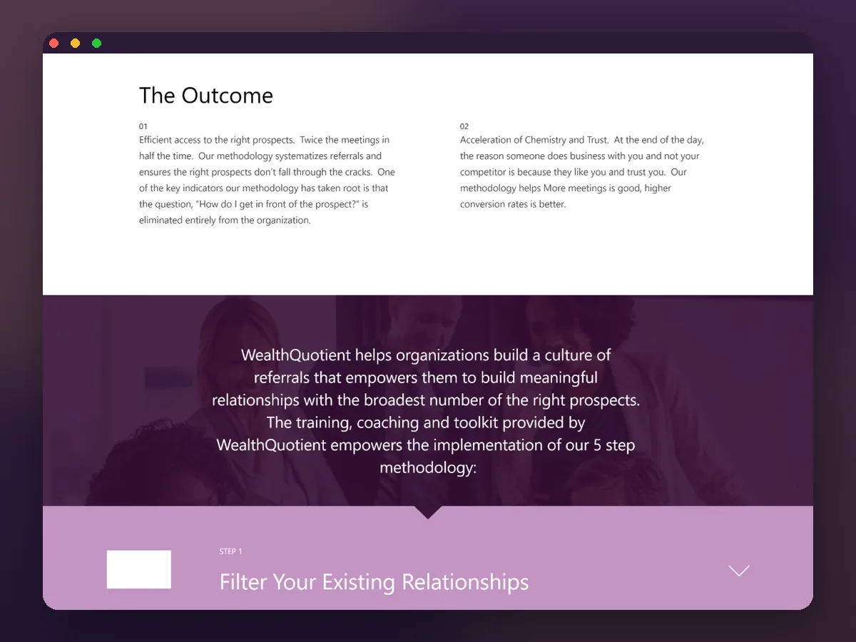
Methodology · The argumentThe methodology page turns the firm's process into a five-step accordion — filter, map, ask, build, bespoke — each on its own band, so the method reads as a sequence rather than a paragraph.
The problem, then the outcome
Challenge · The thesisBefore the steps, the methodology page states the challenge and the outcome plainly — efficient access to the right prospects — so the reader is sold on why before they read how.
One method, four markets
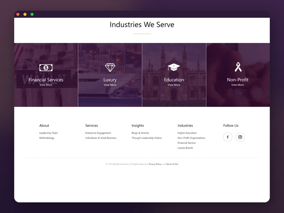
Industries · The reachFinancial services, luxury, education and non-profit each get a card on the home page, showing the same method applied across the markets the firm serves.
What does a visitor actually want to know?
The site answers its own questions in order — what you offer, and whether the method only works for wealth management — before it ever asks for a meeting.
How does the five-step methodology read?
The methodology page is the heart of the site, and its five steps are the firm's whole argument for how a team grows in the ultra-high-net-worth market. The design gives each step its own band so the sequence is impossible to miss.
- 01Team
Filter your existing relationships
The method starts inside a team's own book — existing clients, donors and centers of influence — because those relationships already connect to the qualified prospects worth pursuing.
- 02Team
Map the social graph
Those relationships are mapped as a social graph, surfacing the ambassadors the site calls HUBs, who sit between the team and the accessible high-net-worth prospects.
- 03Team
Ask for the introduction
Teams are trained to ask, specifically and well, for the introduction to an identified prospect, rather than chasing people they have no relational avenue into.
- 04Team
Build the profile
A picture of the prospect is built ahead of the introduction, so the first conversation is informed and relevant rather than cold and generic.
- 05Team
Be bespoke
The approach is tailored to the individual, accelerating the chemistry and trust that ultimately decide whether business in this market is won.
The scope, in one panel
Every number in this panel is delivered scope — what was designed, built and handed over on the consulting build for WealthQuotient. It leaves out traffic, conversion and revenue on purpose: those figures belong to the client, and we don’t publish numbers we cannot stand behind.
- Industry
- ConsultingUHNW advisory & training
- Platform
- Marketing websiteBrochure site
- Key pages
- Home · MethodologyIndustries
- What we did
- UX + UI designWeb design, content architecture
The look, and why
A deep aubergine and gold palette, generous space and quiet typography make the site read as a trusted advisor rather than a sales funnel — restraint, for a relationship-led market.
What does a methodology-led site need to get right?
WealthQuotient forced these decisions, but the pattern carries to any firm whose product is a way of working rather than a feature.
Give the method its own page
If the method is the product, it earns as much design weight as the home page — not a paragraph on an about page.
Sell the why before the how
State the problem and the outcome plainly before the steps, so the reader is sold on the thesis before they read the method.
Route different buyers differently
An enterprise team and an individual professional want different things — split the paths instead of forcing one funnel.
Let restraint signal credibility
In a relationship-led, discreet market, a disciplined palette and quiet typography read as trustworthy where noise reads as a sales funnel.
Designing a consulting website
How long does it take to design and build a consulting website?
How do you make a professional-services brand feel credible online?
Should a consulting site explain the methodology or just list services?
How much does a marketing website cost to design and build?
Can you design a site around our own framework or methodology?
Need a website that sells how you think?
Tell us how your business actually works and we'll tell you honestly what it takes to build — the thesis, the method, the pages. No deck, no pitch.