


One page,built to convert.
A conversion-focused landing page for a professional resume-writing service, designed to take a nervous job-seeker from a headline to a chosen package without a single dead end.
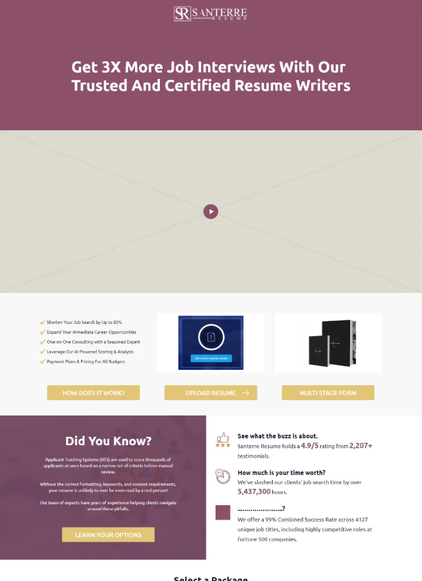
A single page that carries the whole sale
The page opens on the promise, backs it with what the service does, then puts a four-tier package selector at the centre so a visitor can find the level that fits their budget and career stage. A three-step 'how it works' and a clear call to action carry them the rest of the way.
The package selector is the hinge
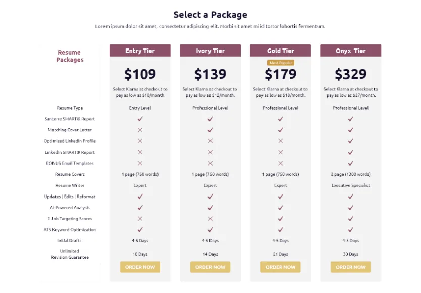
Four tiers, from entry level to an executive specialist, are laid out side by side so a visitor self-selects rather than being sold to.
Every claim is made concrete
A feature-by-feature comparison, a SMART report, a cover letter, LinkedIn optimisation, replaces vague promises with a checklist a buyer can read.
One scroll, no dead ends
Value, price, process and call to action are sequenced so a visitor is never left wondering what to do next.
Why is a service landing page hard to design?
A resume service is intangible, personal and priced across a wide range, so one page has to justify a spread of budgets, build trust in a stranger's writing, and turn a browsing job-seeker into a buyer, all before they scroll away.
Three constraints shaped it: pricing has to justify itself at a glance, trust has to be earned before any payment, and the same page has to speak to an entry-level job-seeker and an executive without alienating either.
What the Santerre page had to carry
A single scroll has to justify a spread of prices, build trust in a stranger's writing, and never leave a visitor wondering what to do next.
One scroll, no dead ends
- Let visitors self-select. Four tiers laid out side by side rather than one plan pushed at everyone.
- Replace adjectives with a checklist. A feature-by-feature comparison a buyer can actually read.
- Sequence value, price, process, call to action. So no visitor is left wondering what happens next.
- Repeat the order path. So intent is never more than a scroll away from action.
Why it was hard
- Four tiers, seen at once, have to read as an obvious choice rather than a confusing one.
- Buying resume writing means trusting a stranger with your career, before any payment is made.
- The same single page has to speak to an entry-level job-seeker and an executive without alienating either.
- An intangible outcome has to be made to feel concrete before a visitor will commit to it.
Four tiers, four buyers
The same page has to speak to very different buyers in one scroll — each tier is really a distinct persona choosing their own level.
The entry-level job-seeker
Needs a strong, ATS-ready core resume at an accessible price point — the accessible way in.
The professional
Competing for a role rather than a first job, with professional-level writing and a matching cover letter.
The established professional
Steps up to AI-powered analysis, LinkedIn optimisation and a longer, unlimited-revision window.
The executive
Gets an executive specialist writer, the full toolkit and the longest revision guarantee.
How does the page walk a visitor to an order?
The 'how it works' section turns an intangible service into three concrete steps, so a hesitant visitor can see exactly what buying involves before they commit.
- 01Visitor
Tell us what you need
A free resume audit and a one-to-one with a writer open the process, so the first step costs the visitor nothing but their brief.
- 02Writer
Collaborate with a writer
The visitor is promised direct access to a seasoned writer and a hassle-free process, framing the service as a partnership rather than a black box.
- 03Visitor
Choose the right package
The four-tier selector lets them match their budget and career stage to a tier and order, the moment the whole page is built around.
The look, and why
A warm gold marks the call to action against a deep plum ink, so the one thing a visitor should do next is never in doubt on a page carrying four price points.
What does a high-converting service landing page need?
These came out of designing this page, and they hold for any single-page site selling an intangible, considered service.
One page, one job.
Value, proof, price and call to action in a single scroll, so the visitor never has to navigate away to decide.
Pricing a visitor can self-select from.
Tiers laid out side by side let people find their own level instead of being pushed to one.
Concrete deliverables, not adjectives.
A feature comparison a buyer can read beats a paragraph of promises about quality.
A process that removes fear.
Three plain steps turn an intangible service into something a nervous buyer can picture.
Trust before the ask.
A free first step and a clear guarantee earn the right to request payment.
A call to action that is always in reach.
The order path repeats down the page so intent is never more than a scroll from action.
Building a service landing page
How long does it take to build a conversion landing page?
How do you design pricing tiers that actually convert?
How do you sell an intangible service on one page?
Does a landing page need to work on mobile?
Need a landing page that turns visitors into buyers?
Tell us how your pricing and your offer actually work and we'll tell you honestly what it takes to build a page that converts. No deck, no pitch.