


Objects for the quiet hours
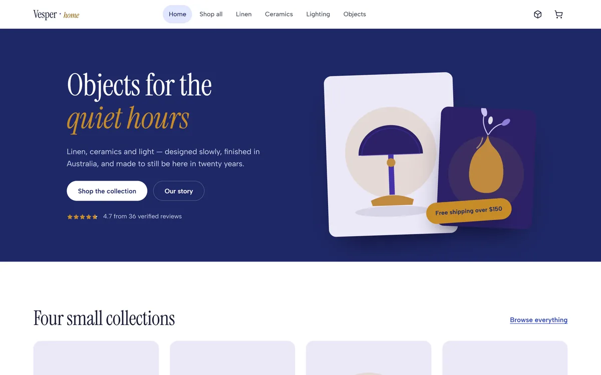
A small-catalogue homewares store built end to end: a filterable collection, product pages that answer the questions a buyer actually has, a moderated review system, a GST-inclusive cart, and an inventory console whose edits land on the storefront while you watch.
Sector
- Homewares and interiors
- Direct-to-consumer retail
Product surface
- Storefront and admin console
- 12 products, 4 collections
What we did
- Product modelling
- UX and UI design
- Design system
- Front-end engineering
Retail detail
- GST-inclusive AUD pricing
- Free-shipping threshold
What is Vesper Home?
A store for a brand that sells twelve things rather than twelve thousand. That constraint changes the whole design: with a small catalogue, every product page has to do the work a category page does elsewhere, and the operator running it needs stock and reviews on one screen rather than a warehouse system.
A small catalogue is a different problem to a large one
Search matters less; the reasons to buy matter more. So the storefront leans on collection browsing, honest availability, and product pages carrying dimensions, materials, shipping and owner reviews - the things that stop someone leaving to look them up.
Why do small-catalogue stores lose the sale?
Rarely on price. They lose it on unanswered questions - how big is it, what is it made of, when will it arrive, does the brass base feel cheap - and on stock that says one thing on the grid and another at checkout. Both are fixable in the build.
| The moment | A templated store | How Vesper Home does it |
|---|---|---|
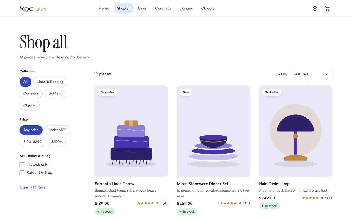
| Browsing the range | A grid and a search box | Four collections plus price, availability and rating filters with five sort orders |
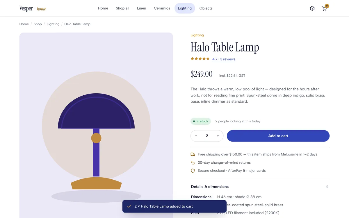
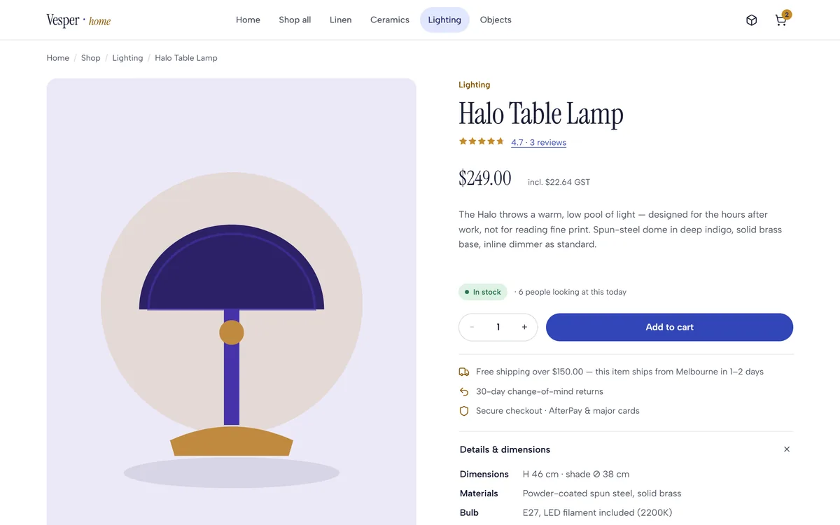
| Judging a piece | Photos and a paragraph | Dimensions, materials, bulb and cord spec, shipping window and returns on the page |
| Reading reviews | A star average | A clickable rating histogram, verified-purchase badges and four sort orders |
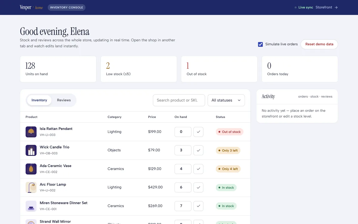
| Low stock | Discovered at checkout | "Only 3 left" and "Out of stock" on the grid, driven by the same value the console edits |
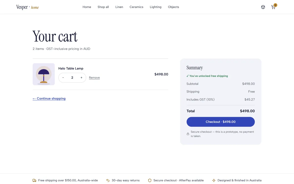
| Understanding the price | Tax added at the end | GST-inclusive AUD throughout, with the GST component itemised in the cart |
| Shipping cost | Revealed at checkout | A free-shipping threshold shown on the product page and unlocked visibly in the cart |
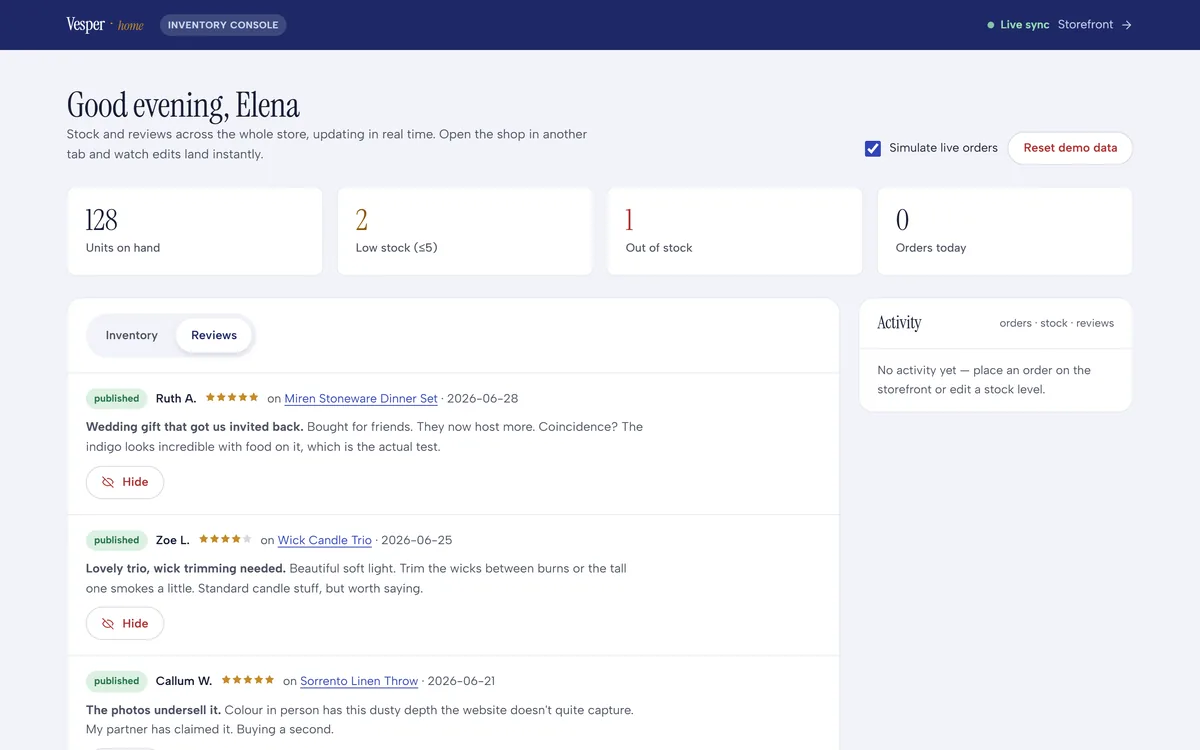
| Publishing a review | Straight to the page, or never | A moderation queue in the console with publish and hide on every entry |
What did we build?
Eight screens covering both surfaces: the storefront a customer moves through, and the console the person running the shop lives in.
Catalogue
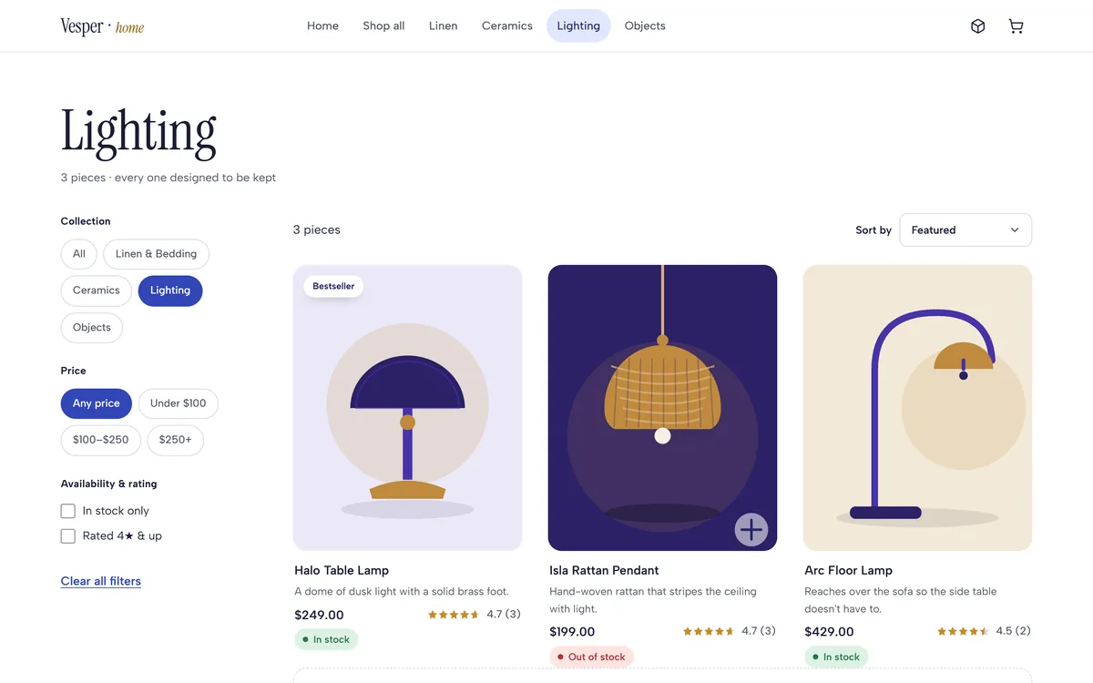
12 products, 4 collectionsLinen and bedding, ceramics, lighting and objects, each product carrying a SKU, category, price, sale price, rating, review count and a live stock state.
- SKU per product
- Bestseller and new flags
- Sale pricing
Browse and filter
4 filter groupsCollection, price band, availability and rating, combined live against five sort orders with a written empty state.
- 5 sort orders
- Clear all
Product page
Spec + shippingDimensions, materials, what is included, the shipping window, returns, and a related-products rail that stays inside the collection logic.
- Details panel
- Goes-well-with rail
Reviews
Rate, sort, moderateA clickable rating histogram, verified-purchase badges, helpful counts, four sort orders, a submission form, and an approval queue in the console behind it.
- Verified purchase
- Moderation queue
- Helpful votes
Cart and pricing
GST-inclusive AUDQuantity controls, an itemised GST component, a free-shipping threshold shown as unlocked, and a persistent cart count in the header.
- Tax itemised
- Free-shipping unlock
Inventory console
2 tabs, 4 KPIsStock and reviews on one screen, with units on hand, low stock, out of stock and orders today above an editable product table.
- Editable stock
- Activity feed
How did we build it?
Three passes took a homewares brand from a product list to a store with a working back office.
What does a small-catalogue store need?
Six things that decide whether a twelve-product store converts. They are cheap while the store is being built and expensive to add once it is selling.
- Put the specification on the page. Dimensions, materials, what is in the box and the shipping window are the reasons a considered purchase completes. Behind a support email, they are the reason it does not.
- Make availability one value. Grid, product page and console must read the same number, or the first person to find the discrepancy is a customer at checkout.
- Give reviews structure and a gate. A distribution, sorting and verified-purchase marks make reviews persuasive; a moderation queue keeps them trustworthy.
- Show tax and shipping the way the market expects. An Australian store quotes GST-inclusive prices and itemises the component - getting this wrong reads as a foreign store, whatever the domain says.
- Design the empty and low states. No results, out of stock, only three left, an empty cart. These are seen constantly and are usually the least designed screens in a store.
- Build the console alongside the shop. Whoever runs the store edits stock and approves reviews daily. If that needs a developer, the store is not finished.
Why does it look like this?
Homewares sold on restraint should not be sold in a loud interface. The palette is a deep indigo ink with a single brass accent for anything premium or promotional, on white and a cool off-white. Instrument Serif carries the headlines with the poise of a print catalogue; Albert Sans keeps prices, specifications and filters plain.
Aa
Primary typeface
Instrument Serif
A B C D E F G H I J K L M N O P Q R S T U V W X Y Z
a b c d e f g h i j k l m n o p q r s t u v w x y z
0 1 2 3 4 5 6 7 8 9 & ? ! £ $ €
44pxObjects for the quiet hoursDisplay30pxYour cartH120pxHalo Table LampH318px$249.00Price15pxBody copy, specifications and review textBody12pxIN STOCK - ONLY 3 LEFT - BESTSELLERBadgeThe palette is authored in OKLCH in the store's own token file and converted to hex here. Only two colours ever carry meaning: indigo for the action you are meant to take, brass for anything premium or urgent - which is what lets a low-stock badge register instantly on a page of neutrals. Instrument Serif and Albert Sans are open-licence typefaces; the specimen above falls back to the nearest available face if they are not installed on your device.
What is it built with?
A dependency-free front end over a single product model, with the storefront and the console sharing one state layer and one token file.
Building an e-commerce store
What retail founders ask us before committing to a custom build.
Ask us yoursHow much does an e-commerce website cost to build?
It depends far more on the operational surface than on the shop. A storefront over a small catalogue is predictable work; the cost sits in inventory, review moderation, tax and shipping rules, and whatever integrations your fulfilment already uses. Shanti Infosoft scopes it on a short call and returns a fixed quote within 48 hours.
Should we use Shopify or build a custom store?
Use a platform when your requirements are ordinary and your differentiation is the product. Build custom when the buying experience itself is the differentiator, when you need an operational console shaped around how your team actually works, or when platform fees on your volume outrun the build cost.
Why do product reviews need moderation?
Because unmoderated reviews are the fastest way to lose trust in both directions - spam on the page, or genuine reviews silently rejected by a filter. A queue with publish and hide on every entry keeps the trust layer of the store owned by a person, and it takes minutes a day rather than a policy.
How do you handle GST on an Australian store?
Quote GST-inclusive prices everywhere and itemise the component in the cart. Australian shoppers expect the number on the product page to be the number they pay, and a store that adds tax at checkout reads as foreign. The same principle applies to the free-shipping threshold: show it before checkout, not at it.
What does an inventory console need on day one?
Stock you can edit in one place, low-stock and out-of-stock visible at a glance, a review queue, and a record of what changed. Everything else can wait. The test is whether the person running the shop can do a normal day's work without asking a developer for anything.
Related work and reading
Planning a store of your own?
Tell us how your business actually works and we will tell you honestly what it takes to build. See more of our work or what we do.
Book a 15-minute call