


Made to order
A single-page storefront for Galaxy Guitar Products USA, whose finger protectors and finger extensions are made by hand. Diameter, length and finish are chosen before an order is confirmed, so the page has to sell a specification rather than a stock item.

Sector
- Musical instrument accessories
- Adaptive and assistive products
Store type
- Made-to-order storefront
- Confirmed-order flow, no cart
What we did
- Content architecture
- UX and UI design
- Front-end build
- SEO and accessibility pass
What we built
- 4 product models
- 8 colour finishes
- 22-image filtered gallery
- 7-row price and shipping table
What does this storefront sell?
Galaxy Guitar Products USA makes finger protectors and finger extensions by hand for players who have lost a fingertip or cannot press a string without pain. Almost every order is custom: an interior diameter, a length, a finish. The hard part is never taking the money. It is getting a buyer to the right specification before anybody commits to making something by hand.
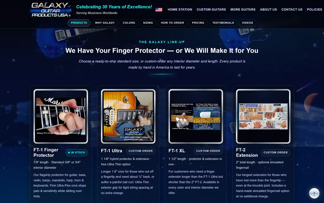
One page that answers every question ahead of the order form
The store puts the whole buying decision on a single scroll, in the order a buyer actually asks about it: the four models side by side, what makes them different, the finishes, how to measure, what it costs to ship, the terms, and only then the order sequence.
Why is a made-to-order product hard to sell from a website?
Nothing in this catalogue is a stock item you drop into a basket. Three decisions have to be made correctly before an order is worth taking, and a conventional product page helps with none of them.

| Buying decision | A multi-page brochure catalogue | This storefront |
|---|---|---|
| Finding the product line | Six top-level buttons, guitars first | A line-up section with all four models on one row |
| Comparing the four models | Described in prose on separate pages | Four spec cards plus a four-tab deep dive |
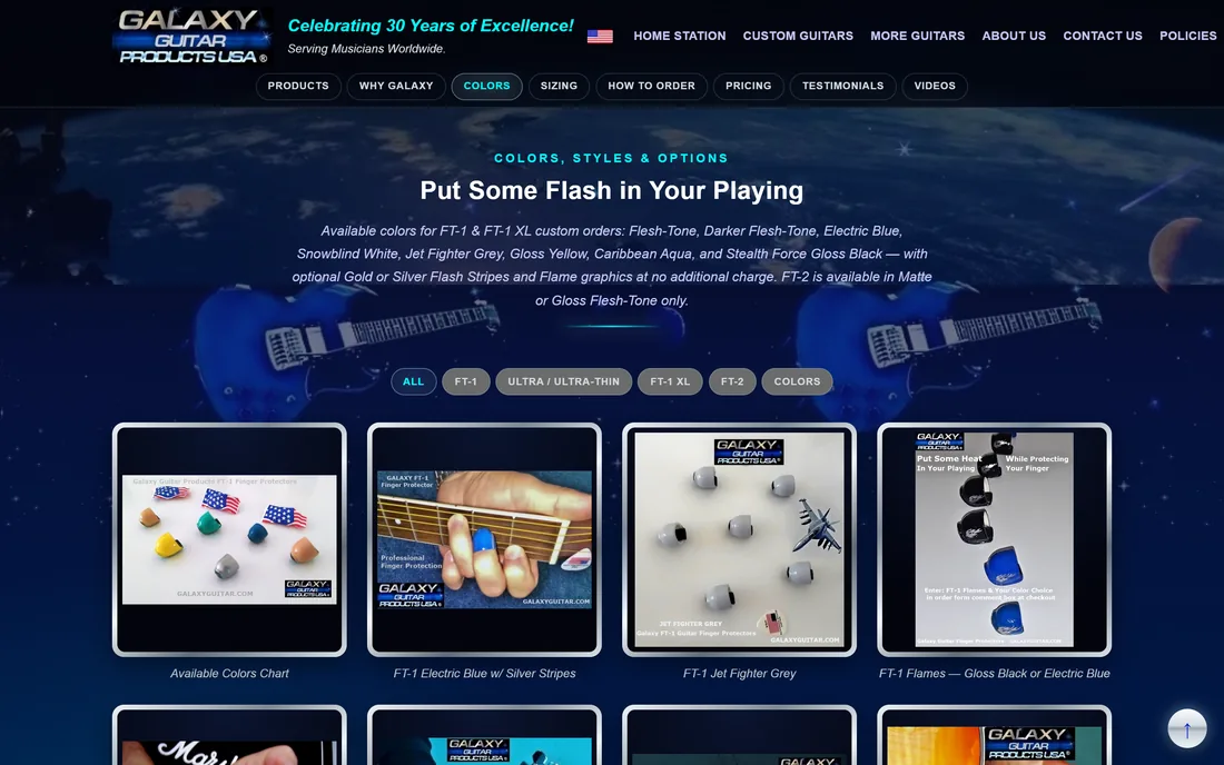
| Seeing the finishes | Photographs spread through the pages | A 22-image gallery behind six filters |
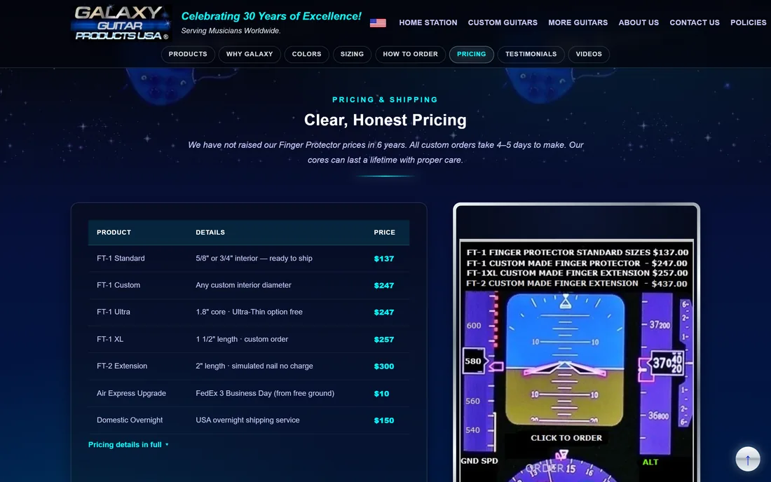
| Checking the price | Quoted inside body copy | A seven-row price and shipping table |
| Getting the size right | Written measuring instructions | A sizing section with the measurement photo and the request rules |
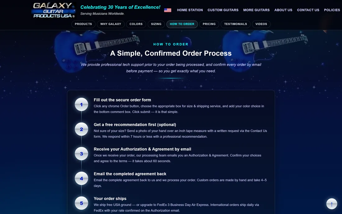
| Knowing what happens after ordering | An order form on its own page | A five-step confirmed-order sequence |
| Reading the terms first | A separate policies page | A four-panel policy accordion on the same page |
What can you actually click?
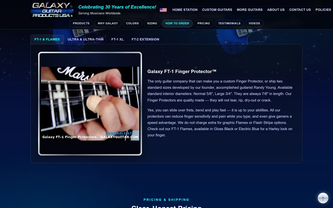
Every screen below is a section of the same single page.

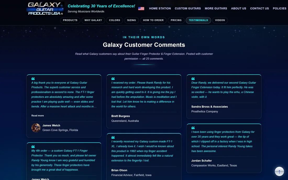
How did we turn thirty years of catalogue into one page?
There was no shortage of material. The work was deciding what a buyer needs in which order, then making the specification decision the spine of the page.
What changes when a whole catalogue moves onto one page?
Two ways of presenting the same range, captured in the same browser at the same size. Drag the handle. On one side the catalogue is spread across a set of brochure pages and the visitor has to guess which button leads to the product they want. On the other it is a single scroll where the line-up, the proof and the route to an order all arrive without a click.
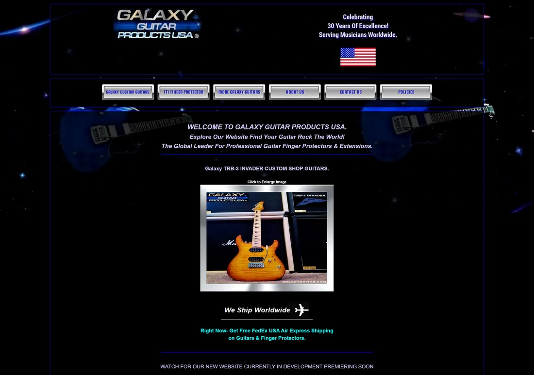

Left: the line-up, the finishes, the sizing guide, the pricing and the order path on one scroll. Right: guitars first, six top-level buttons, and the protector range one click away.
What does a made-to-order storefront need?
Six things separate a storefront that sells a configured, hand-made product from one that sells stock. They came out of building this one and apply to any small-batch or bespoke manufacturer.
- Put the variants on one row. If your models differ by a fraction of an inch, prose will never show it. A comparison row does the whole job in one screen.
- Treat configuration as content, not as a form field. Finishes, lengths and options belong in a browsable gallery before the order form, because they are half the reason someone buys from you rather than off a shelf.
- Give the blocking measurement its own section. There is usually one number that decides whether the product fits. Photograph it, explain it, and say plainly who owns the decision.
- Show the price and the shipping in the same table. Split them across pages and a buyer assumes the worst about the half they cannot see.
- Draw the order process before the order button. A confirm-then-manufacture flow is reassuring once someone understands it and alarming while they do not.
- Put the awkward policy on the page. A no-returns rule on a hand-made item is defensible when the reason sits next to it, and looks like a trap when it is hidden behind a link.
What does the interface look like, and why?
The palette is the brand's own, held in tokens in the stylesheet rather than sampled off a screenshot. Everything sits on a deep space-navy base because that is the visual language the brand has used for years; aqua carries every heading and accent, gold is reserved for the service promise, and magenta only ever appears on contact details.
Aa
Primary typeface
Arial
A B C D E F G H I J K L M N O P Q R S T U V W X Y Z
a b c d e f g h i j k l m n o p q r s t u v w x y z
0 1 2 3 4 5 6 7 8 9 & ? ! £ $ €
54pxThe global leader for professional...Hero40pxSection headingH130pxSub-section headingH220pxProduct nameH317pxLead copy and card headingsLead16pxBody copy, specifications and table cellsBody14pxTHE GALAXY LINE-UP · COLORS, STYLES & OPTIONSKickerThe type stack is deliberately Arial with a Helvetica fallback: no web font is downloaded, so first paint is immediate on a slow connection and the page renders identically on every machine. Sizes live in eight tokens that step up once at large viewports, which is why headings grow without a single per-section override. The aqua swatch above is the store's real #00FFFF; the teal used for links and labels on this case-study page is that same aqua darkened until it clears 4.5:1 on white, because pure aqua is unreadable on a light surface.
What is it built with?
Deliberately boring and static. A catalogue that changes a few times a year does not need a build pipeline, and a musician on a slow connection benefits from a page that is mostly text and images.
Building a storefront for made-to-order products
What small manufacturers ask us before they commit to a rebuild.
Ask us yoursHow long does it take to build a storefront like this?
Four to seven weeks for a single-page catalogue of this size, working from copy that already exists. Most of the time goes on the content audit and the ordering decisions, not the code. If a real checkout, variant pricing and payment handling are in scope, plan on eight to twelve weeks instead.
Do I need a shopping cart to sell a custom product?
Often not. When every item is made by hand to a specification, a cart forces you to guess the price before you know the size, and it removes the conversation that prevents a wrong order. A confirmed-order flow - enquiry, emailed authorisation, agreement, then manufacture - fits the business better, and that is what this store implements.
How much does an e-commerce rebuild cost?
It depends on three things: whether payments are handled on the site or by invoice, how many product variants have to be priced, and whether existing copy and photography can be reused. Shanti Infosoft scopes it on a short call and comes back with a fixed quote inside 48 hours.
Can existing branding survive a rebuild?
Yes, and it is usually the right call. This store uses the brand's own colours, photography and copy; what changed is the structure. A recognisable brand carried into a clearer layout keeps the trust that thirty years of trading built while removing the friction the old structure created.
What makes a product gallery useful rather than decorative?
Filters that match how people shop. Twenty-two photographs in one grid is a wall; the same photographs behind six filters - by model, and by finish - let someone comparing two extensions see only those two. The filter set should come from the buying decision, not from your folder structure.
What happens to SEO when a multi-page catalogue becomes one page?
You trade many thin pages for one deep one, which usually wins on a small catalogue. The safeguards are keeping every product name, price and specification as real text, giving each section a heading and an anchor, and keeping the old URLs alive with redirects so nothing that already ranks is thrown away.
Related work
Selling something that is made to order?
Tell us how your business actually works and we will tell you honestly what it takes to build. See more of our work or what we do.
Book a 15-minute call